This design concept was one of my design tasks at ZEISS as UX Designer.
Goal
This design concept was one of my design tasks at ZEISS as UX Designer.
The goal of the design concept was to ensure the continuity of web search user journey and prevent users from dropping off when they land on the “No results” page. At the same time, it was needed to enhance product related information and make it more accessible.
My role
- I gathered requirements from different business stakeholders to identify the problem to solve. As ZEISS has different business units, the challenge was to provide the solution that would fit all of them;
- I realized a benchmarking of our competitors and other websites to see how they deal with web search UX and UI design;
- I designed the solution and used unmoderated usability tests to challenge design choices and validate the final concept.
Result
I created a design concept that fits requirements of business stakeholders and users’ expectations. As observed during unmoderated usability testing of the final prototype, users acknowledge the information on the “No results” page and continue their web search journey. They also identify product related information by interacting with filters and noticing related “Product Pages” label.
The concept implementation is currently a part of the backlog.
Problems to be solved with the design concept
Process

Research
Competitive Benchmarking
In my benchmarking, I primarily focused on how ZEISS’ competitors and also global brands designed their “no result” pages.
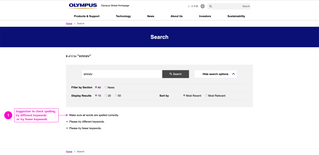
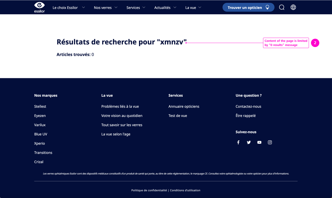
Through my analysis, I figured out that Most of Zeiss’ competitors such as Olympus, Siemens, Philips, Hexagon, Mitutoyo suggest to check spelling, try different keywords or try fewer keywords as the only content for the “No results” page. Other competitors do not suggest anything and the content of the page is limited by “0 results” message, it’s the case for Essilor, Baucsch + Lomb, Wenzel.
Same “No results” page concept is picked by a selection of global brands – Cisco, P&G, Nesltle, Airbus, Bayer, Mastercard, Allianz who suggest to review the search term or just display the “0 results” message not giving the user much opportunities to continue the search journey.
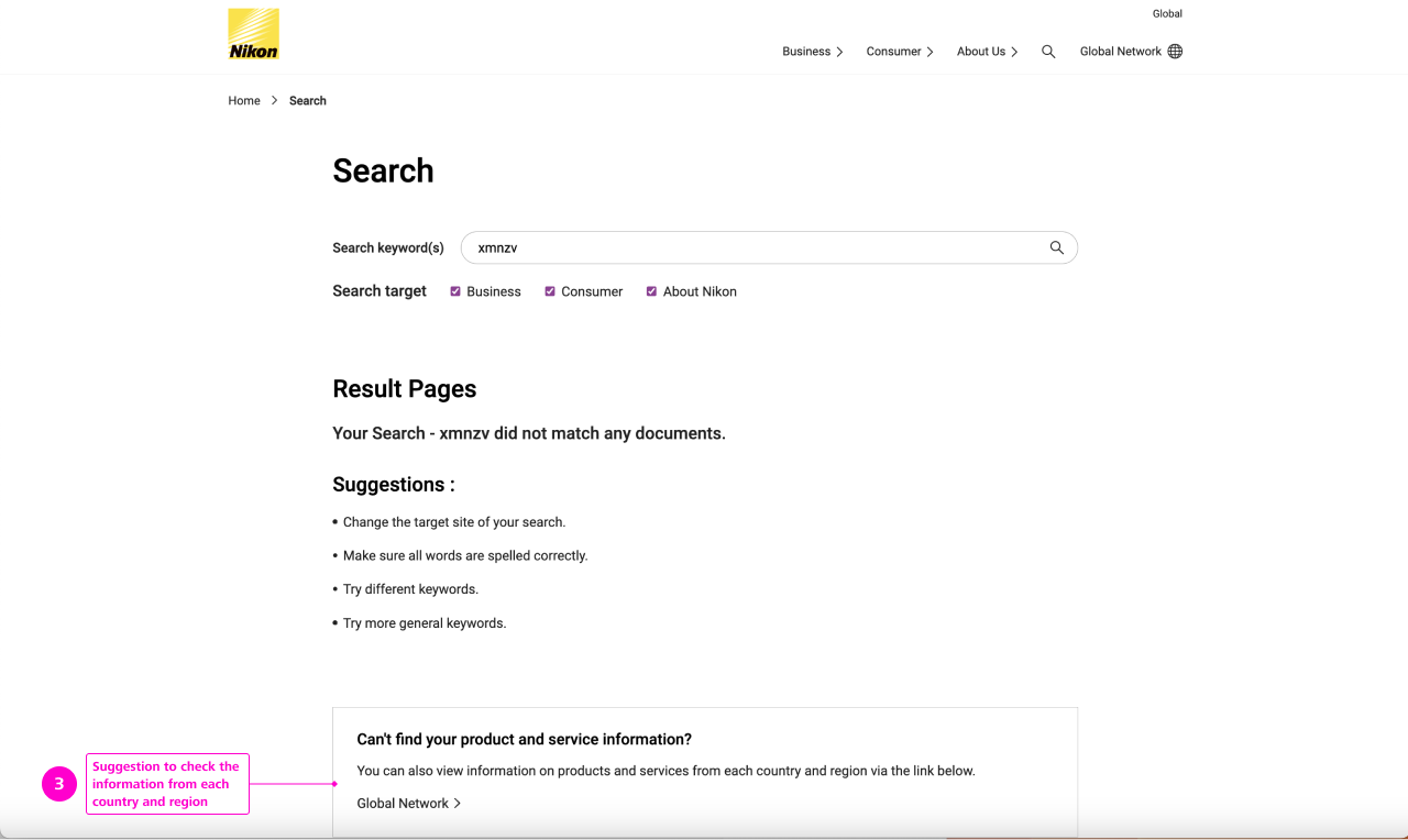
Interesting scenario is suggested by Nikon – the user is suggested to check the information from each country and region via click on the link sending to another page where the user can select region and area. “Can’t find any product and service information? You can also view information on products and services from each country and region via the link below – Global network”.
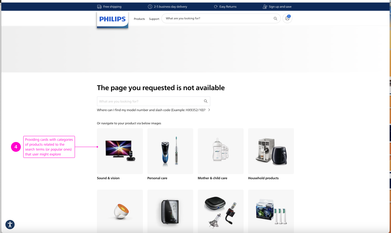
Philips also suggests searching in a different country. The webpage the link “Try searching in a different country” sends to is informing that the page is not available but provides an overview of available categories represented by pictures + titles.
Conventions
I identified various conventions in the “no results” pages I reviewed. The main ones that really stuck out were:
- Suggestion to reformulate the search term or to check its spelling;
- Information about “0 results”.
Best practices
Provide cards with categories of products related to the search terms (or popular ones) that user might explore.
Pain points/opportunities
These were pain points I found in the “no results” pages I reviewed:
- Most analyzed websites have a “No results” design that is essentially a dead-end for users, offering no more than a generic set of search tips;
- Websites fail to re-route the user;
- Information about “No results” is usually placed below the search field, the text informing about that is having small typography size and is not prominent enough to be noticed.
Analysis
User Flows
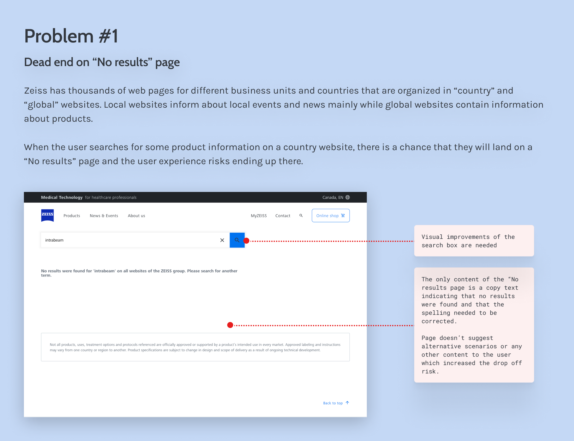
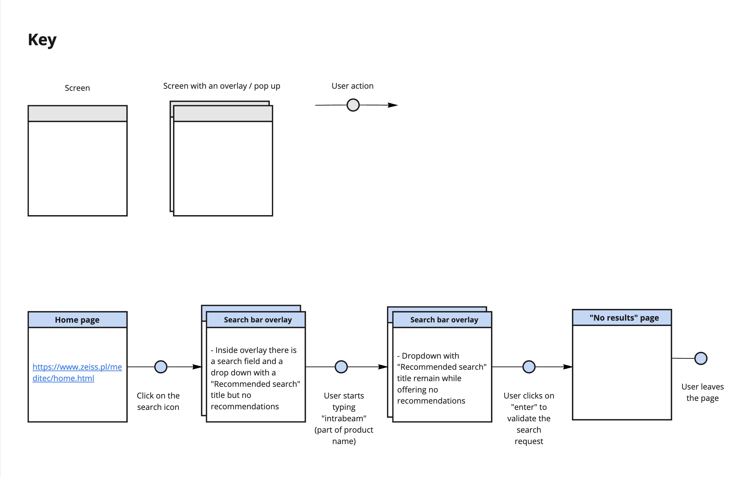
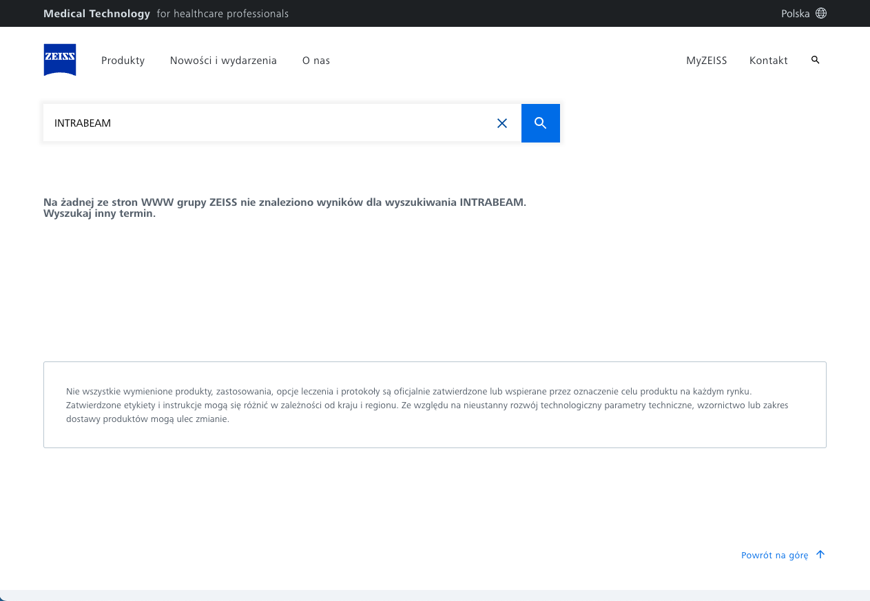
The next step was to define user flows of the web search of different ZEISS business units’ websites. When building those flows, I I had a closer look at the “unhappy paths” where the user lands on the page with 0 results. Here below you can find an example of the Poland country website of Meditec (one of ZEISS business units).
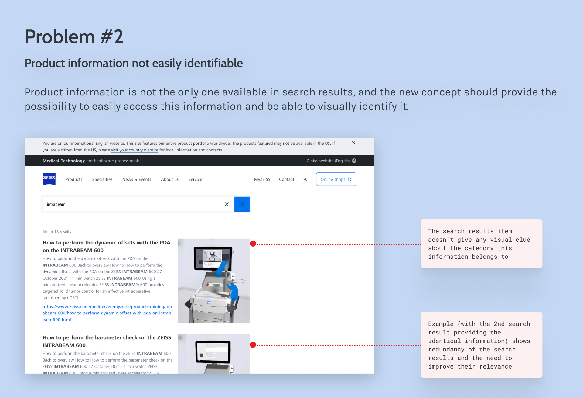
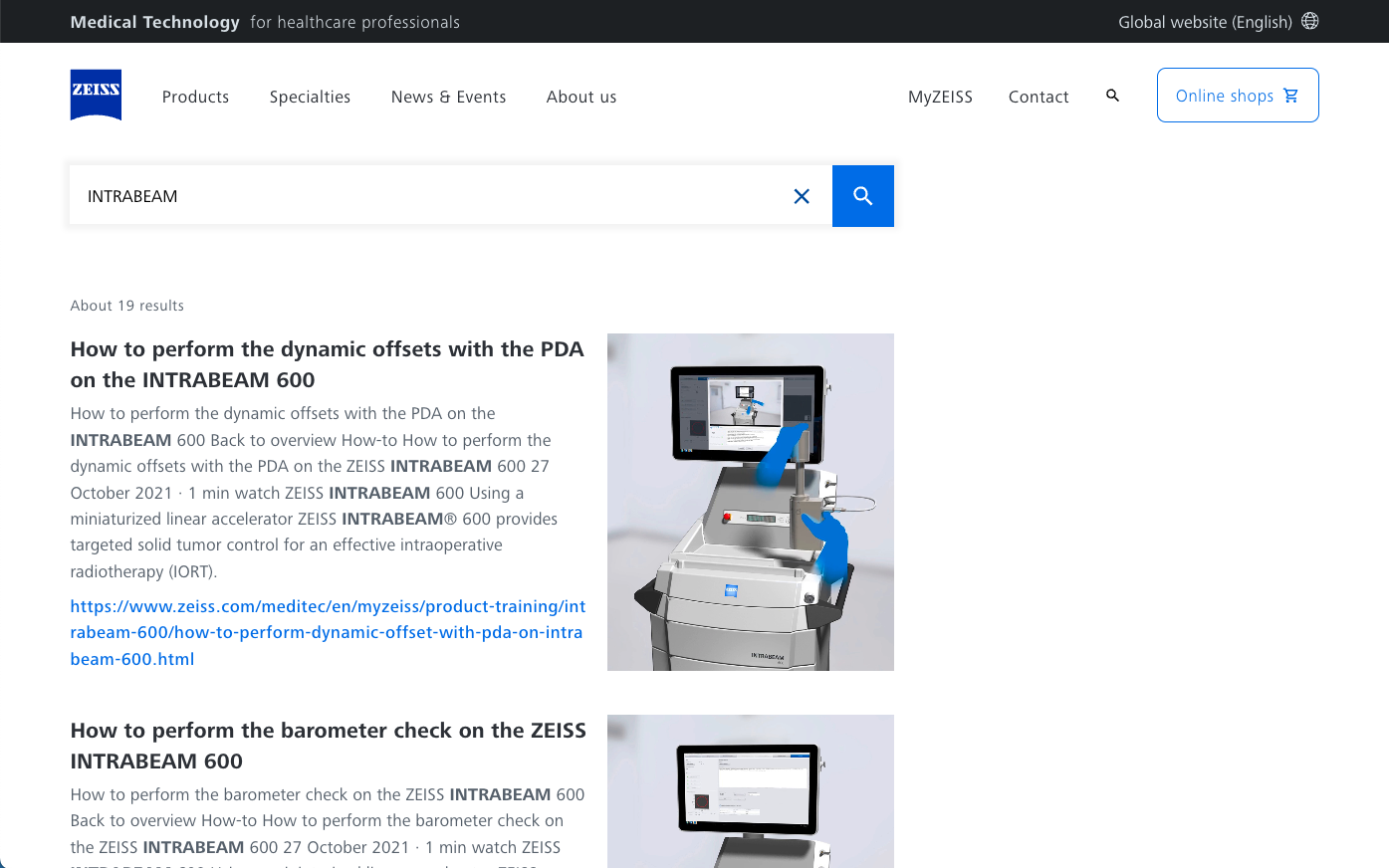
In this example users would not be able to find any product information about “INTRABEAM” (part of the ZEISS products’ name) as product information is only available on global websites. This might be the end of user journey. If we go the English global website, we 19 search results after entering “INTRABEAM” search term.
After analyzing this user flow, the first step would be to connect country and global websites’ search results. At the same time, as a global website in Polish doesn’t exist yet, there is no relevant product information in polish to send polish users to.
Showing to users alternative content in English (as a default language for fallback scenario) directly on the same is not possible due to different internal restrictions. As some products presented on the English global website might not be available in Poland, it’s necessary to inform them about this via a disclaimer before they view this content. This was the main challenge of this design task, as it was not possible to avoid this extra step in user journey, skip the disclaimer part and display the content on the same page that would allow to avoid this disruption of the user experience.
Design – first iteration
In my first iteration of the “no results” page, I analyzed possible scenarios to connect country and global websites’ search results. As detailed in the “Analysis” chapter, it was not possible to pick the most obvious scenario and display the alternative global search results directly on the same local website page due to internal restrictions, it was necessary to inform users about those restrictions before displaying them any content that might not relevant to them.
Another approach I considered was to display tiles with products clicking on which would send to global pages en English. Here again it would mean showing products yo users that might not be relevant to them. After several iterations of explorations and discussions in design team I picked the solution where polish users are suggested to click on the links sending to alternative content.
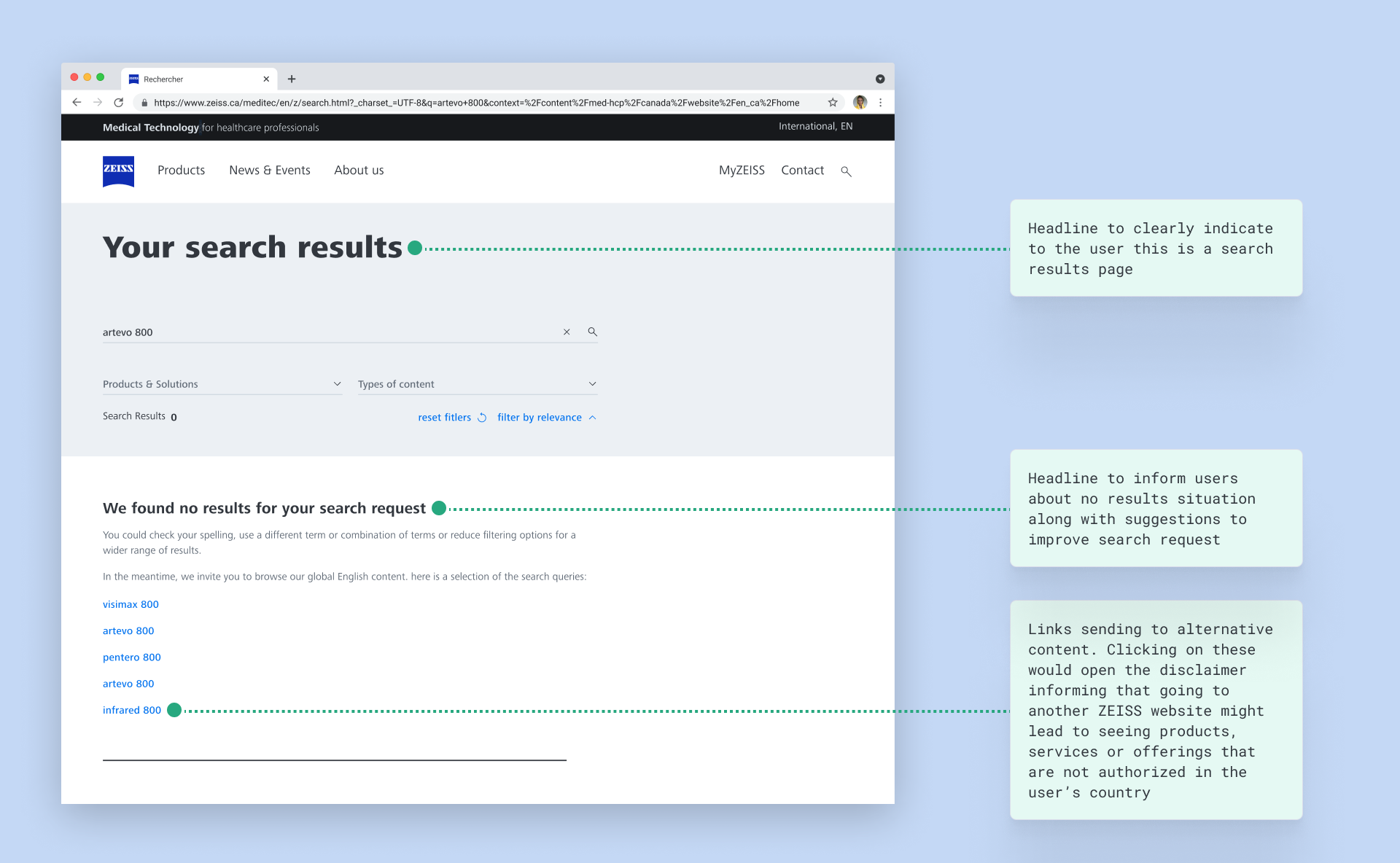
Clicking on these text links would first trigger the disclaimer informing that going to another ZEISS website might lead to seeing products, services or offerings that are not authorized in the user’s country. If users were clicking on “yes”, they would be send to a global website’s search result page with available product information.
I also added a headline text “We found no results for your search request” and suggestions to check spelling or find another term.
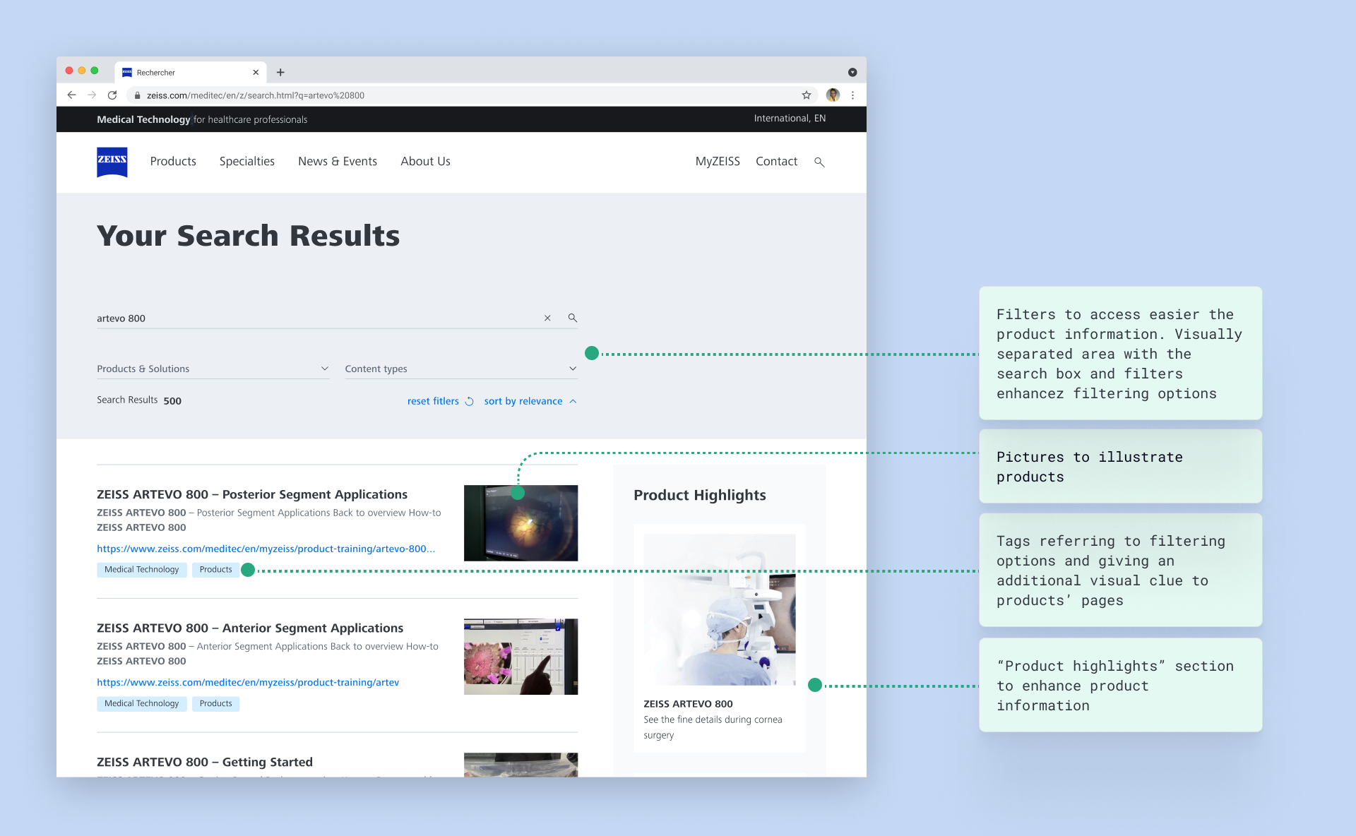
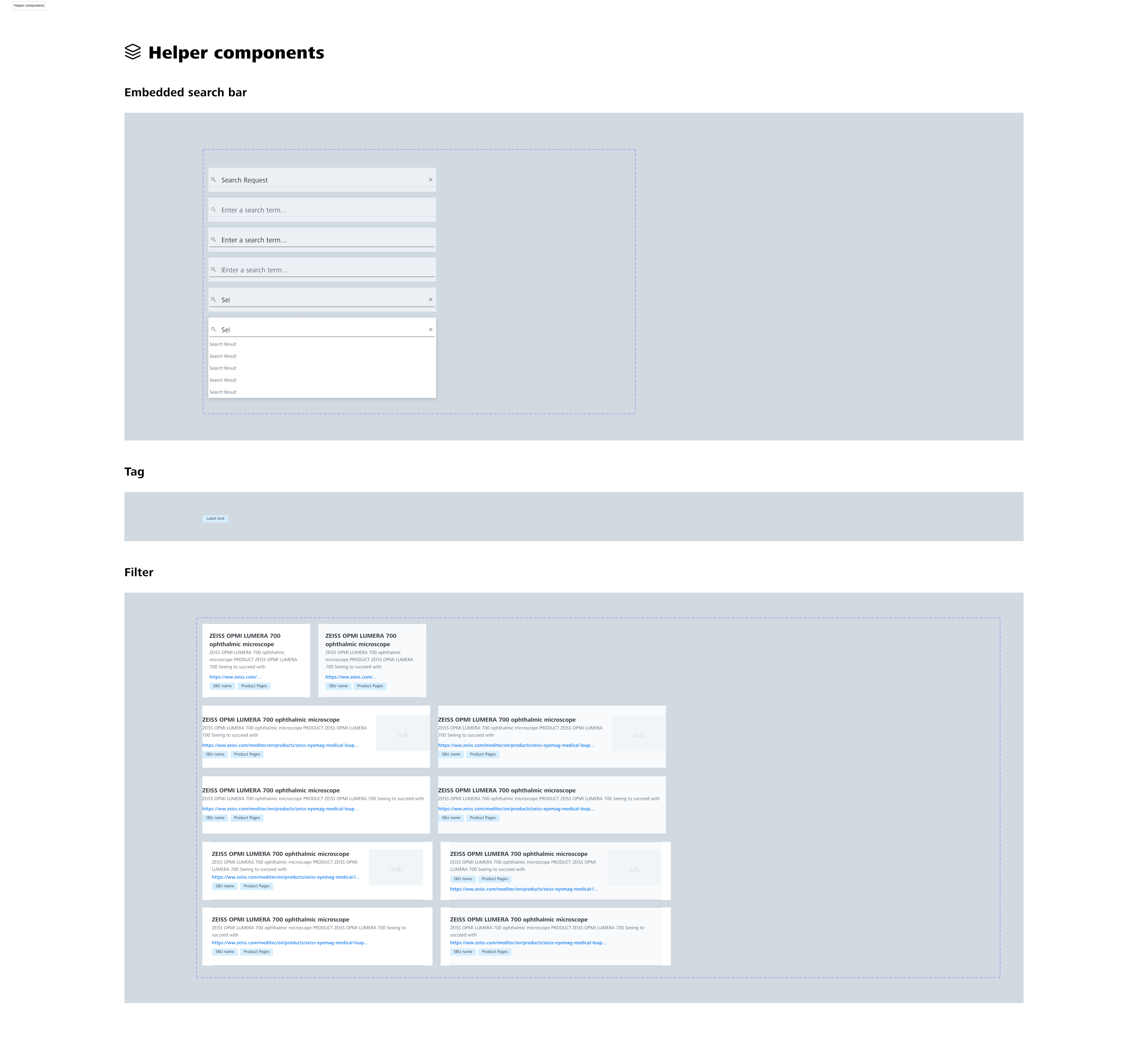
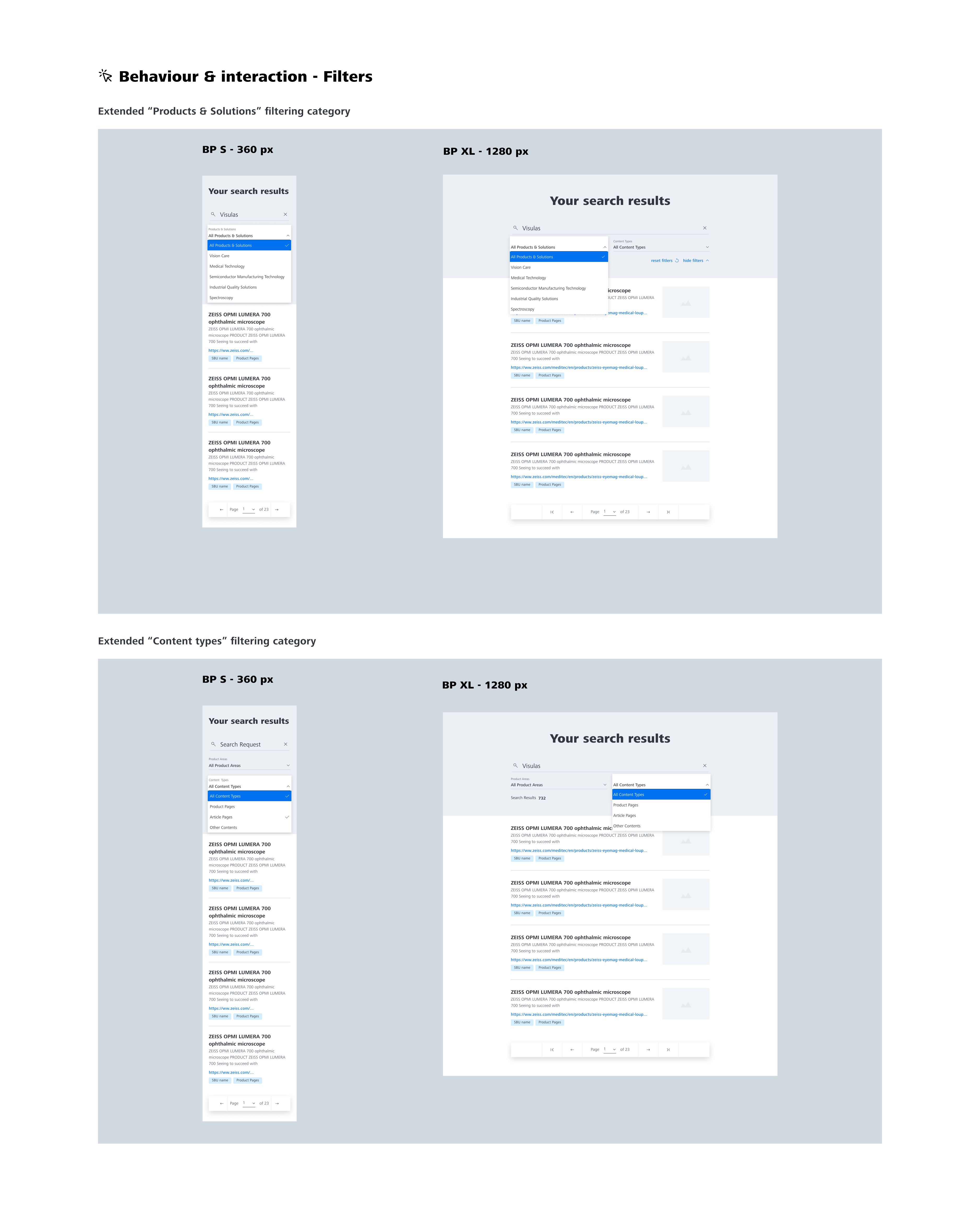
Also, to solve another problem of product information being not visible enough in search results, I enhanced search results page with filters by business unit (Products & Solutions) where I put different ZEISS business units and by a content type represented by products and articles.
In parallel, data analytics showed that users visiting one business unit’s website can search for products of another business unit(s). Based on this finding, it was necessary to connect search results across business units (while prioritizing the search results related to the business whose website the user is on).
To add an additional visual clue to identify easier different types of content, I added light blue tags referring to filters options. Additionally, with the goal of product information enhancement, I added “product highlights” section to the right side of the page with the key products.
Validation
Usability Tests – first iteration
I couldn’t rely only on the competitive benchmarking to validate my design decisions, and I conducted an unmoderated usability test for this project in order to observe how the real users interacted with the new version of the web search.
As a task, I asked users to search for a particular product :
Imagine, that you are an ophthalmologist based in English speaking part of Canada and you are looking for a therapeutic laser, more precisely you are interested by learning more about “visulas” lasers available at Zeiss. To learn more about it, you go to the Zeiss Medical Technology website dedicated to Canada and want to find more information about “visulas”. How would you proceed?
The task was beginning on the Country Canadian website and later users would be sent to the Global English website after clicking on the link in search results users .
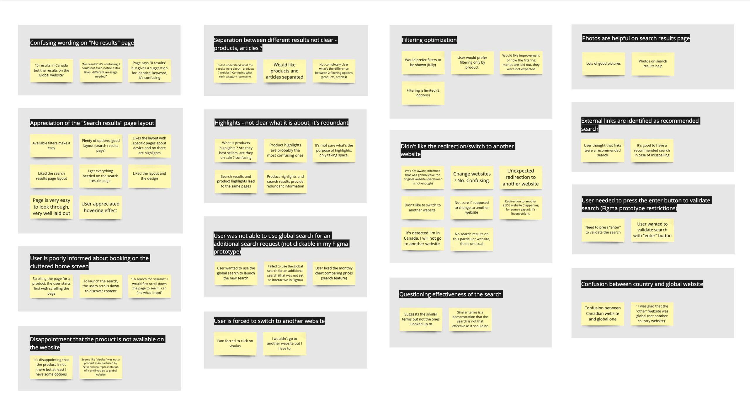
For a full picture of the positive interactions and pain points participants encountered during the flight booking process, I made detailed notes on the realized usability tests. I used sticky notes to break down individual wordy elements according to the experiences of the participants. My goal was to break down all the insights gathered while viewing the videos.
Affinity Diagram
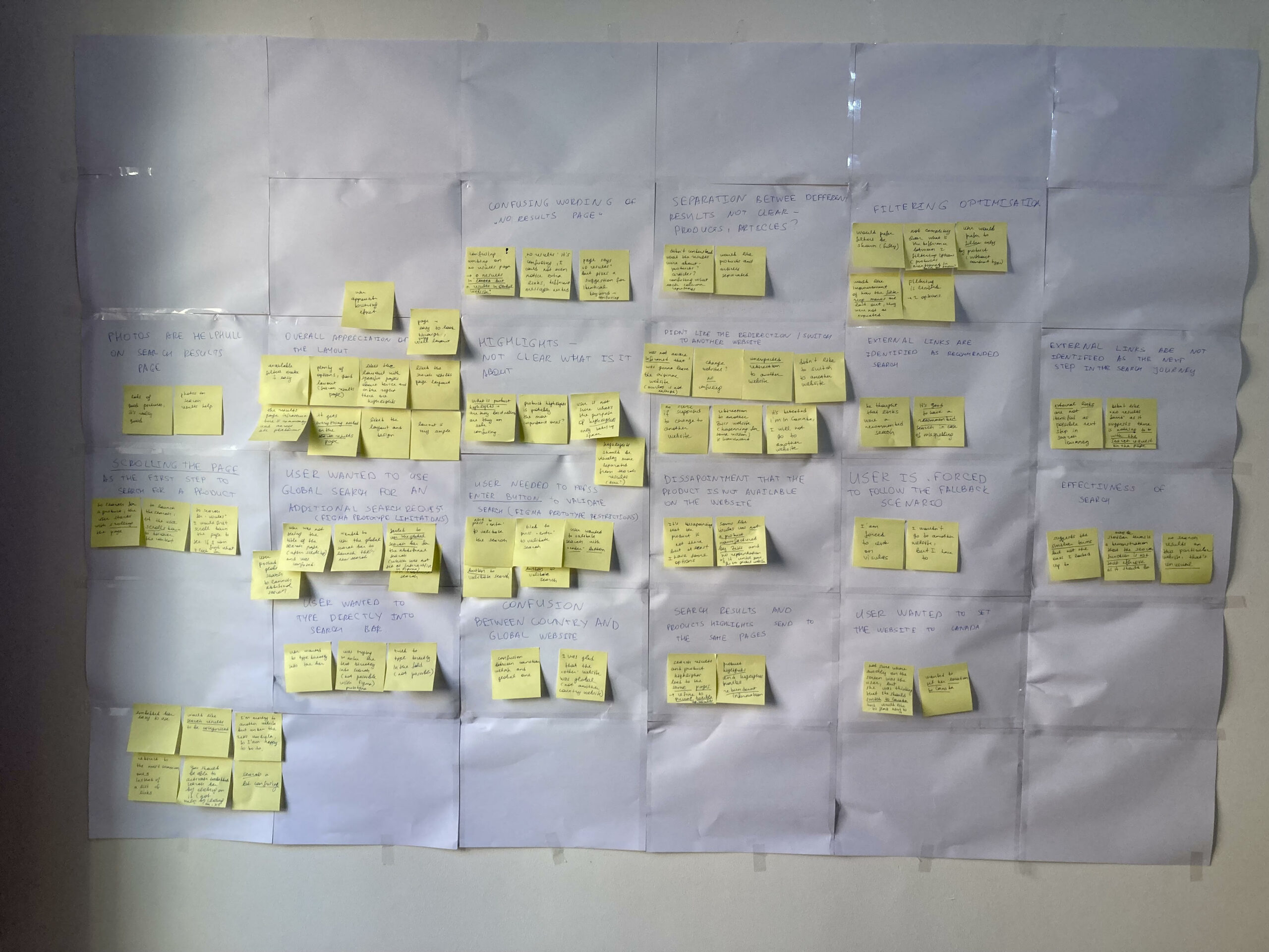
As the next step I combined sticky notes when they were referring to similar negative or positive experiences during web search user journey. It allowed me to clearly recognize commonly appreciated or disliked elements of the user experience while searching for a particular product on a Zeiss website.
To get a big picture of these different patterns, I built an infinity diagram using the sticky notes I prepared while viewing all the usability tests’ recordings.
First I put all the sticky notes on the whiteboard and progressively organized them into groups by a type of a problem. Also, I created groups with similar positive feedbacks that allowed to validate some of design ideas. Here is a list of identified patterns:
- Confusing wording on “No results” page
- Separation between different results not clear – products, articles ?
- Photos are helpful on the “Search results” page, overall appreciation of the “Search results” page layout
- Product Highlights – not clear what it is about, it sends to the same pages as the search results
- Didn’t like the redirection/switch to another website, the fact of being forced to do it
- Confusion between country and global website
Here is the link to the Miro board with the affinity diagram
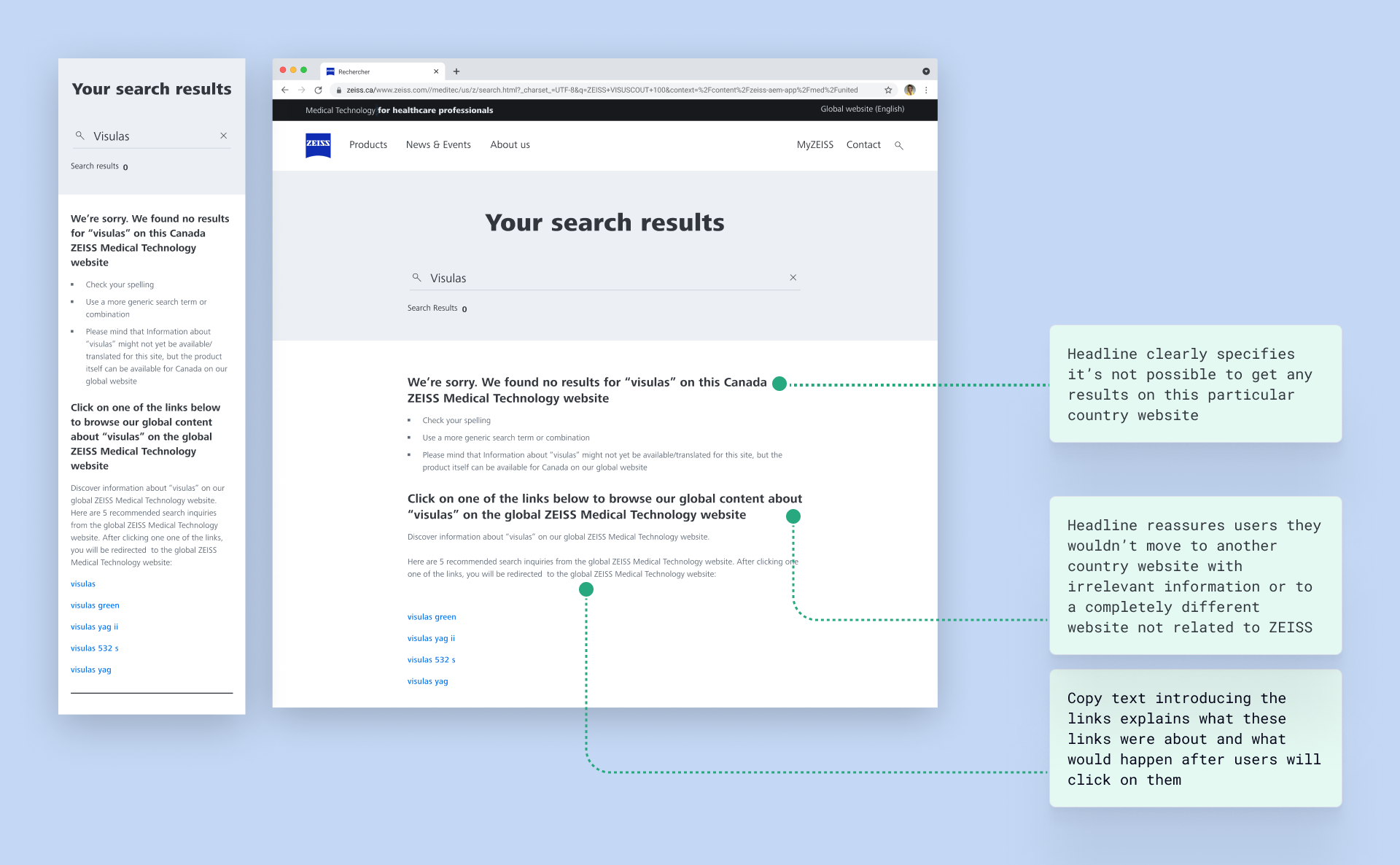
One of the main findings of this usability test iteration was that the wording of the “no results” page was actually confusing. The headline was saying “We found no results for you search request” while actually it was snot completely matching the reality, as the page was suggesting a list of link to explore search results of the global website:
Here is the link to the full video report about the results of the first iteration of unmoderated usability testing.
Design – second iteration
After usability tests, I primarily focused on different pain points identified by users.
- Confusing wording on “No results” page
To address the first problem, I removed the title “We found no results for your search request” identified by users as confusing and replaced it with “We’re sorry. We found no results for “visulas” on this Canada ZEISS Medical Technology website” (as an example). Headline explicitly informs it’s not possible to get any results on this particular country website.
The next headline “Click on one of the links below to browse our global content about “visulas” on the global ZEISS Medical Technology website” explains that is possible to browse global content on global ZEISS website. The goal of this new structure of the copy text and new wording is to reassure users that they would not move to another country website with irrelevant information or to completely different website not related to ZEISS.
I also modified the text introducing the links and explained what these links were about and what would happen after users will click on them. The first iteration of usability test showed a big confusion caused by the disclaimer appearing after a click on a link to the global website. As I was not able to remove the disclaimer from the user journey or even to modify its copy text, I updated the wording placed before the links.
- Didn’t like the redirection/switch to another website, the fact of being forced to do it
- Confusion between country and global website
As I was not able to remove disclaimer from the journey and even change its text for internal reasons, I set modifications in the wording on “No results” pages mentioned above to reassure users.
I also user relevant terms in headlines to explain that search results were not available on the country website but would be available on the global websites. Users were afraid to switch websites as they were thinking it would be another country website, it was important to explain it wouldn’t happen and that it gonna be a global ZEISS website.
- Separation between different results not clear – products, articles ?
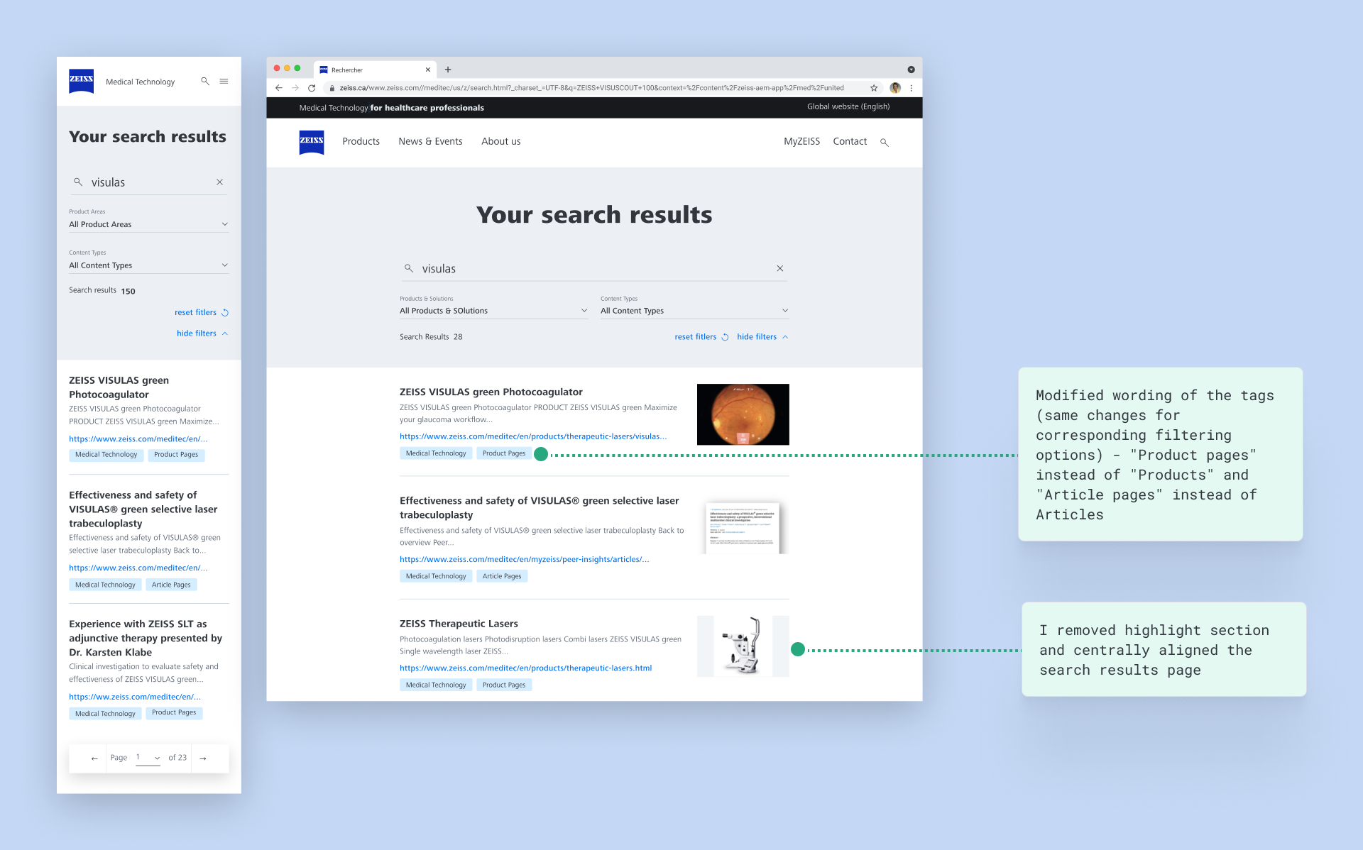
To address this problem, I modified the titles of the filtering options and tags and put “Product pages” instead of “Products” and “Article pages” instead of Articles.
- Product Highlights – not clear what it is about
Users were confused by product highlights, the purpose of this section was not clear. At the same time, internally I learnt that it would require a big effort to identify those highlights across web sites and keeping this feature was not relevant. I removed highlight section and centrally aligned the search results page.
Validation
Usability Tests – second iteration
After the changes I realized after the first iteration of usability tests, it was important for me to validate those changes and proceed with the second iteration of usability tests. This time I reduced to pool of users from 20 to 10 to accelerate the analysis process as the project deadline was approaching.
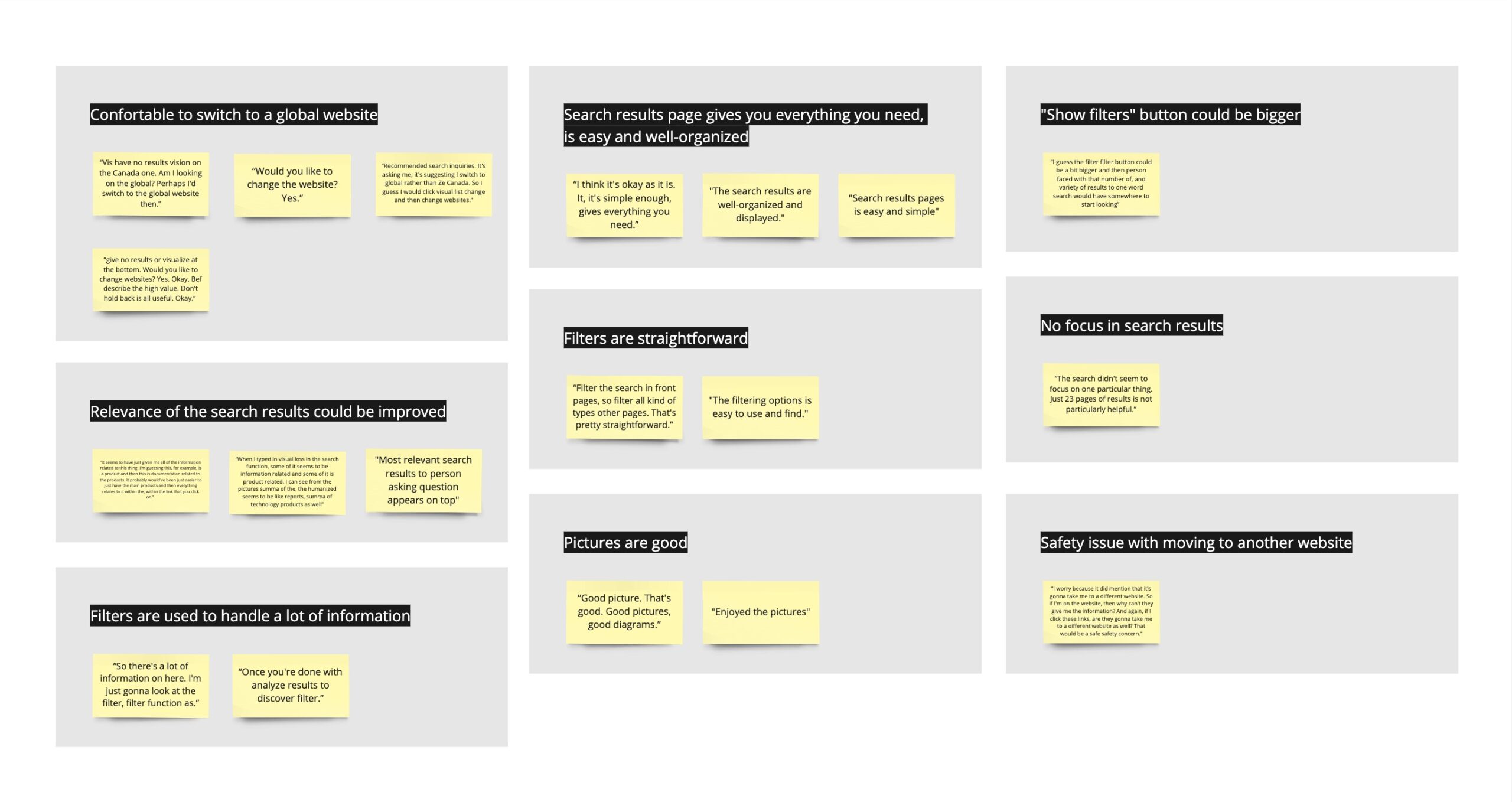
As in the first iteration, I used Maze tool and analyzed results using the affinity diagram that you can see below. Here is the link to the Miro board to have a closer look at it if necessary:
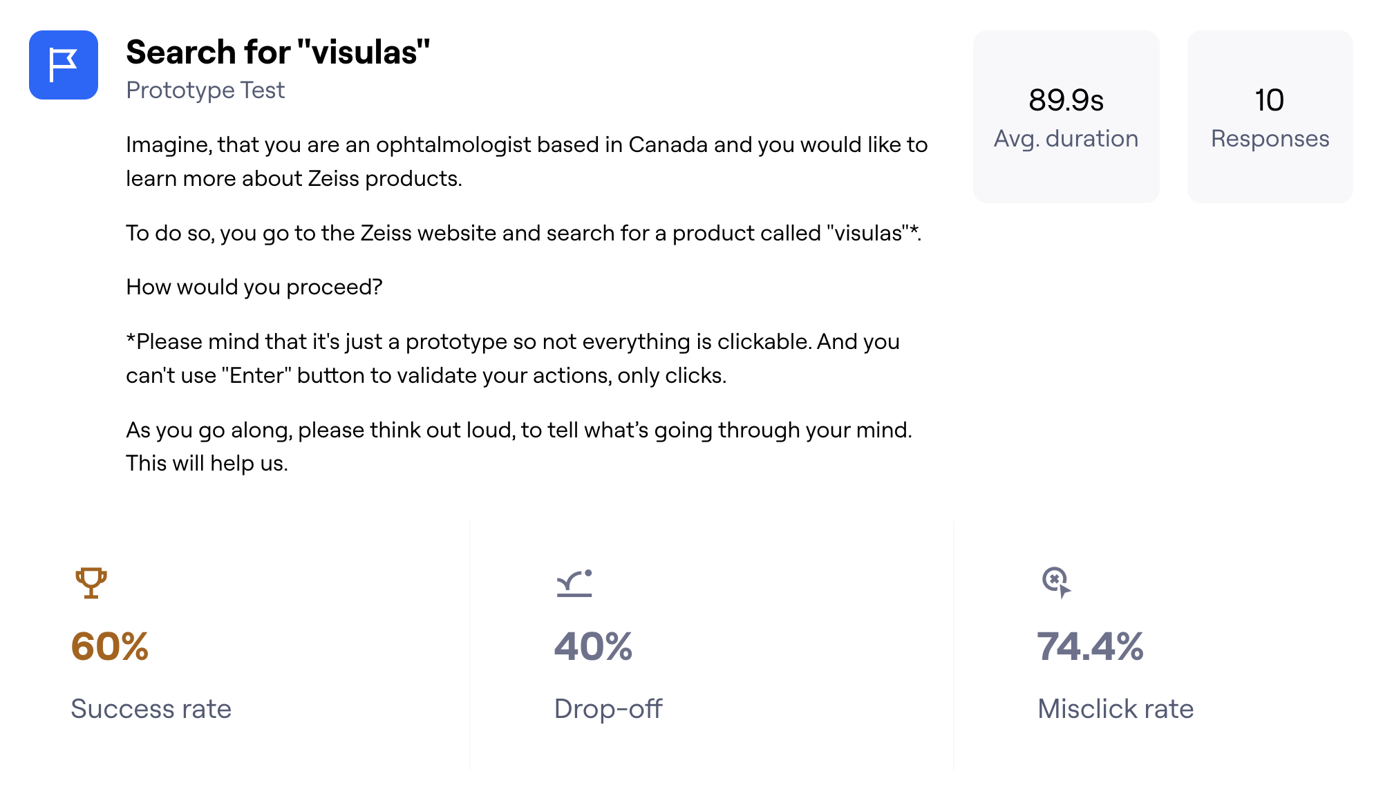
In the 1st task of the second usability tests’ iteration I asked to users was to search for visuals. As showed on the diagram above providing statistics form the Maze tool, 6 users out of 10 were able to finish this task. More specifically users were able to identify the links to the additional information and click on “Yes” on the disclaimer asking if they want to go to another website:
Overall, this first was allowed to identify the pattern showing that majority of users were not concerned any more about switching to another (global) website. Observing their behavior on the “No results” page, I noticed that they were reading headlines and getting the right information letting them know why they would need to switch. Thus the modified wording was serving the intended purpose to reassure users concerned about this necessity to go to another website.
Another identified pattern was about the relevance of the search results. Users found that there were too much of different information and that it would make sense to prioritize the product information. After getting this feedbacks, I made search results pre filtered with the product information by default and set “All product pages” as preselected filtering option.
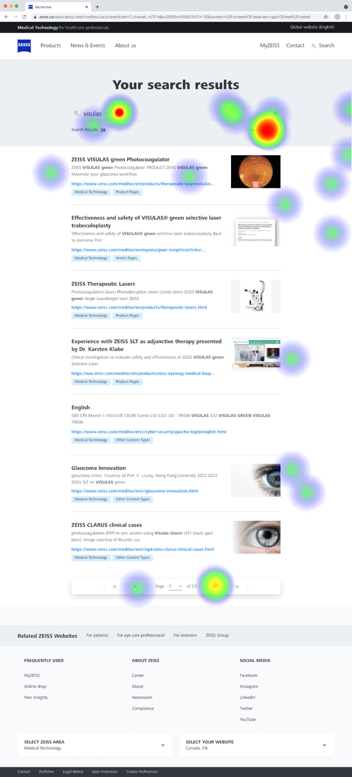
The second iteration of usability testing showed that after being confused by a big amount of information, users used filters which validated the necessity of adding filter bar to the search results page. Also users identified filtering feature as easy to use and find. On the heat map provided by Maze, you can see that click on the “show filters” button gathers the biggest amount of interactions:
Delivery
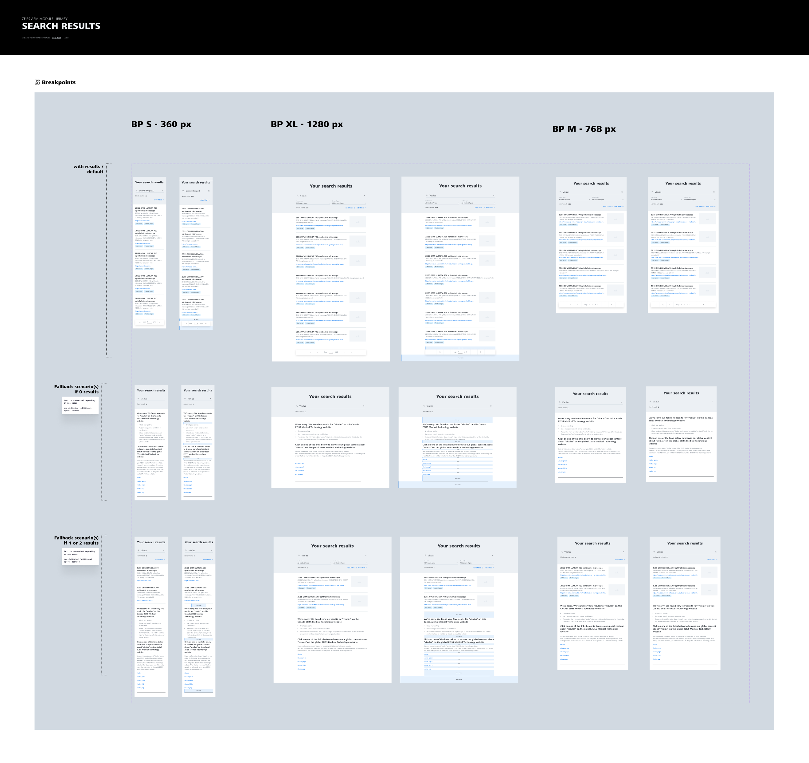
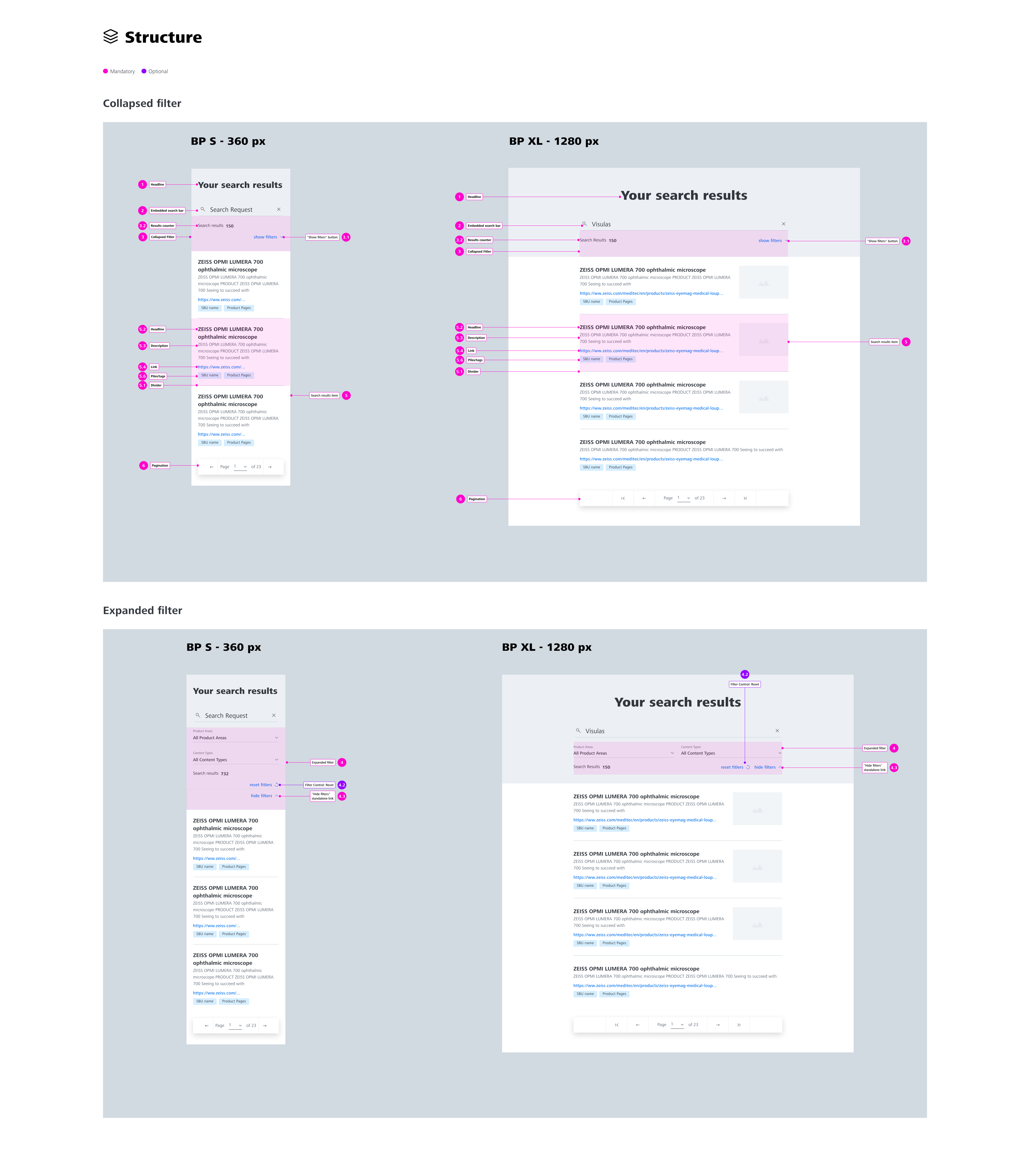
Design documentation
Once I tested and updated my design concept, it was time to create design documentation in Figma for our development team.
Conclusion
Things that went well
- As a part of this design concept, I stepped in a role of an early adopter of Maze, a platform for unmoderated usability tests and was the first designer in your organization to start testing designs with this tool. It allows to validate design ideas very quickly (1-2 days) and with a very low price (100 dollars per test). In general, time and money are the aspects that block research opportunities.
- Iterations of unmoderated usability test allowed to identify pain points of the first design iteration and validate the improvements.
- Design concept of the web search optimization gave me a wonderful opportunity to collaborate with different stakeholders – business representatives, colleagues in charge of the technical “back end” part of the ZEISS web search and designers to take care of different design aspects and provide a concept that meets business requirements.
Things I would have done differently
- I would have quickly built “easy” prototype making clickable only the key interactions instead of investing too much time into creating a fully clickable prototype
- I would have tried to check the expected implementation effort of the final concept with the development team before starting working on it. After the concept was validated and presented, the estimated effort too high and now the implementation needs to be prioritized.
