Goal
The company’s website optimisation was performed as part of a transversal project I oversaw as a Digital Marketing Manager. The goal of this project was to improve the lead generation rate on the website and avoid people leaving the conversion funnel.
My role
I was solely responsible for all stages of the process, including:
- Marketing Research
- UX Research
- UX Design
- UI Design
Result
The feedback I received from my usability test were quite positive. The prototype I have designed allowed improvements to the conversion rate and a reduced drop-off rate.
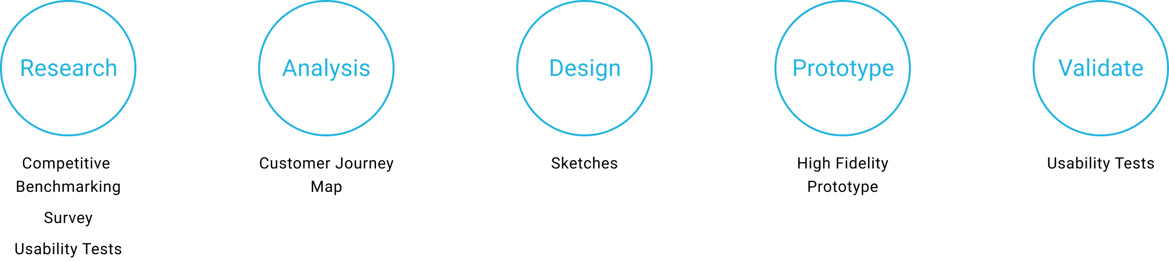
The Process
Tools used

Research
Identifying the Problem
The first thing to do was to identify possible pain points in the current website. If I found these to also be pain points for my user during the usability test, these would be the main areas I would concentrate on changing in my new design.
Below is a brief summary of the main problems I encountered:
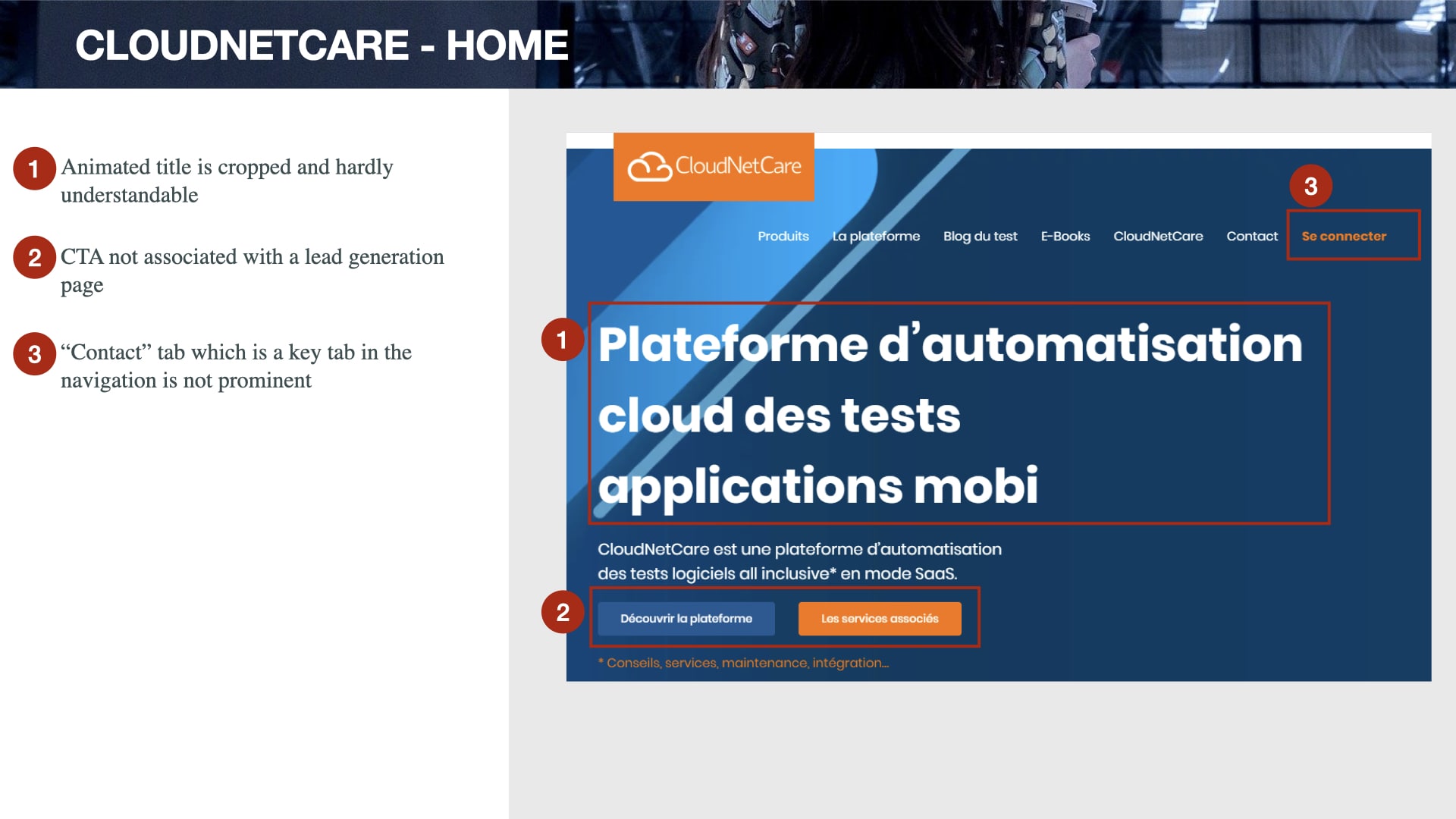
- The slogan is incomprehensible because of an animation that never allows it to be fully displayed
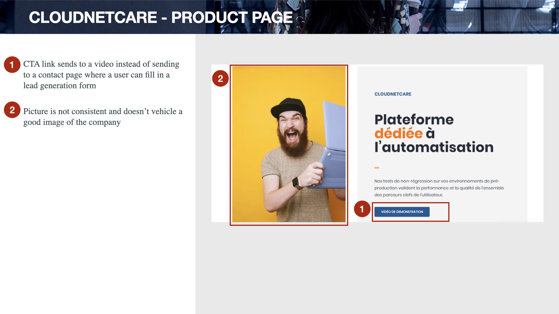
- Call-To-Action (CTA) buttons are absent above the fold on all pages except the home page
- The CTAs on the home page do not force action, but invite users to discover CloudNetCare’s services and its “Platform” page
- The purpose of the site is not clear because no offer is highlighted on the site through CTAs, the site looking like a showcase site
- Existing CTAs are not prominent and have the same colour as other elements on the site
- The header background colour is too dark, making page titles illegible
- No on-site search engine that could helps users find the exact products they’re looking for
Competitive Benchmarking
To compare the website to competitors I completed the same process with Datadog, Cypress, UiPath and Blackfire. Whereas before I was concentrating on the pain points in order to rectify them in my own design, here I also looked at the positive points too.
I identified various best practices and pain points in the web sites I reviewed. The main ones that really stuck out were:
Best practices
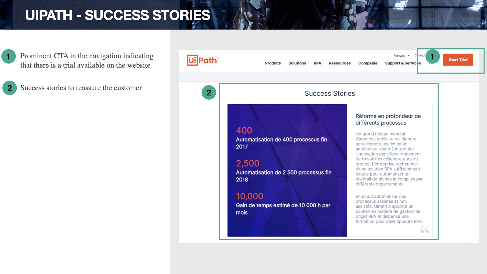
- Good CTA straight away to download a free trial or subscribe to a service
- Detailed and well structured information about software features
- Free trial available and highlighted in the navigation bar
Pain points
-
Companies use different wording in navigation for similar services so it’s not always obvious to the user
-
Some elements in the main navigation might be better at the bottom of the website, i.e., “Blog”; they are given too much priority here and the convention now is to have these at the bottom of the page.
- Contact information easily missed.

Usability Tests
In order to see if other users encountered the same problems with the CloudNetCare website as I did, I conducted multiple usability tests among the target audience.
During these tests I realised that the problems I noted as a part of the research phase were mostly marketing related. However there were lots of issues in terms of user experience that disturbed users and needed to be fixed as soon as possible to improve conversion rates. It was the very first step for me towards my upcoming career change.
Below are the key paint points highlighted by users:
- Key value proposition not clear
- The nature of the service offered by the company is not clear: a software vendor or a consulting firm? Is there a support service to assist customers in installing the software?
- No testimonial to reassure customers
- No breadcrumbs and on-site search for the Blog page. After clicking on an article, it’s difficult to the user to understand his current location on the website
- No breadcrumbs for the “Resources” page
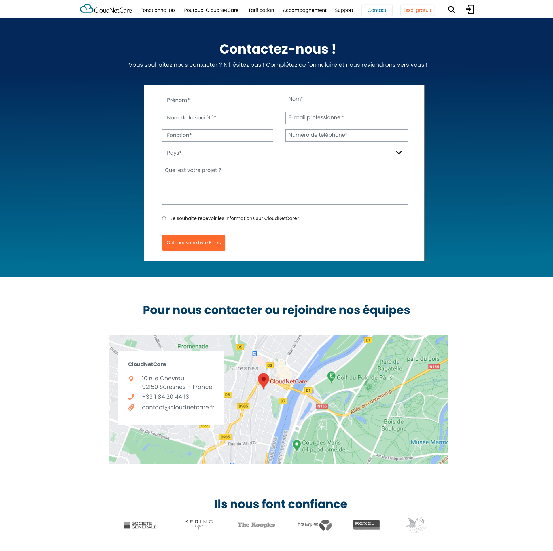
- Empty fields in the drop-down menu of the Resources page
- The width of the form frame is not uniform on some screens
- Responsive design issues (mobile version)
- Important loading time
- The navigation menu is not attached to the top of the screen when the user moves from one page to another
- Pixelated pictures
Analysis
Customer Journey Map
Once I had organized the information, I had gathered during usability tests and benchmarking, the next stage was to transform this data into a Customer Journey Map (CJM). For each step of the Customer Journey Map, I documented the goals of the user, any positive interactions or pain points, and whether there were any behaviours the website or app was not facilitating.
From the below CJM it is clear the main problems appeared on the product page due to very limited information about available services and no pricing information. The absence of CTAs that provide users with the motivation to complete the action made it difficult to find a way to the product pages from the blog articles. I made a point to improve these points in my own design.

Findings
- The majority of the pain points were encountered around the ‘Product page’ stage of the process.
- People want to compare solutions as quickly as possible; they usually do comparative research in a limited amount of time to prepare a report for their decision-making management. Without pricing and clear information about proposed services and features, this task could be very frustrating and end with a drop-off.
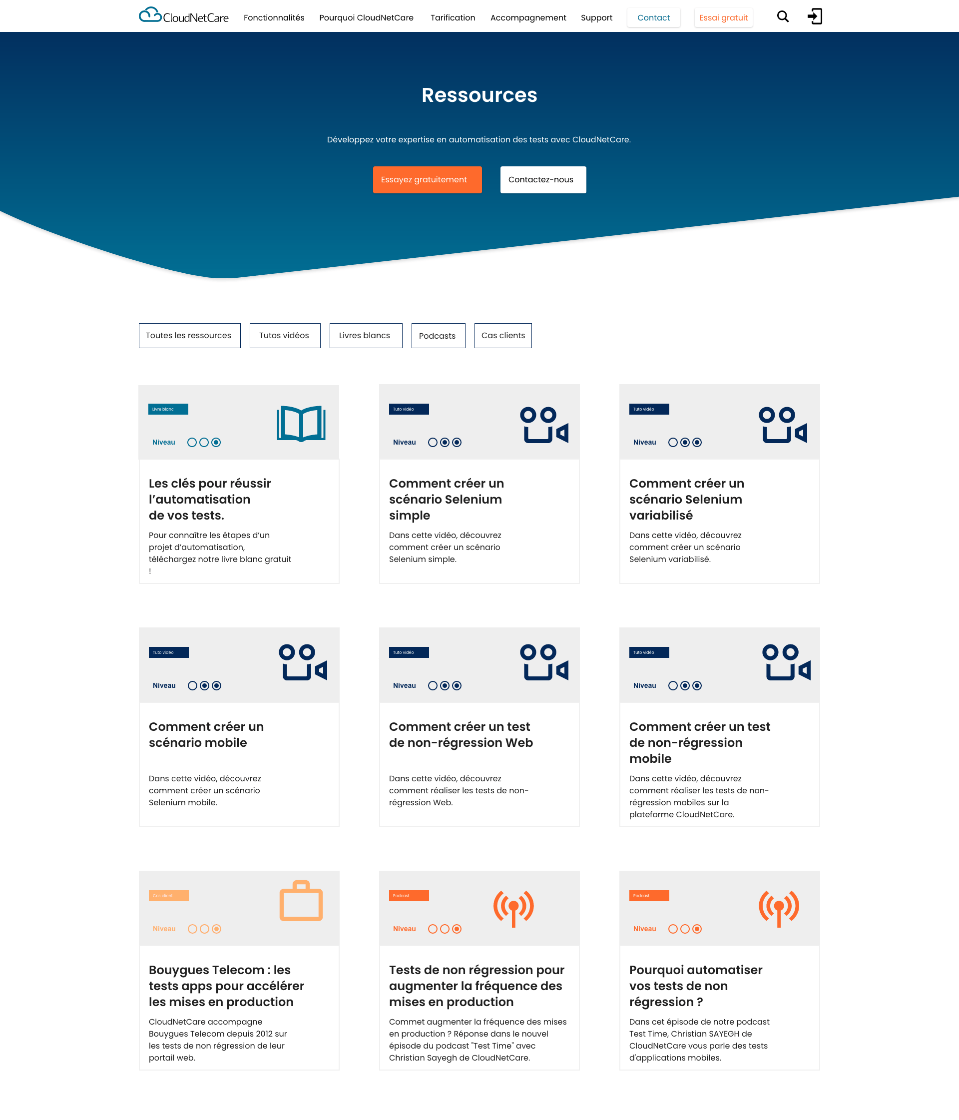
- Expert blog articles can be very useful for a better lead generation rate, but these blog pages should be connected to the product pages via prominent CTAs that force action.
- B2B Customers who are looking for an automated testing software want to be as autonomous as possible while purchasing and using this software; the company is better served offering them a higher level of autonomy.
Design
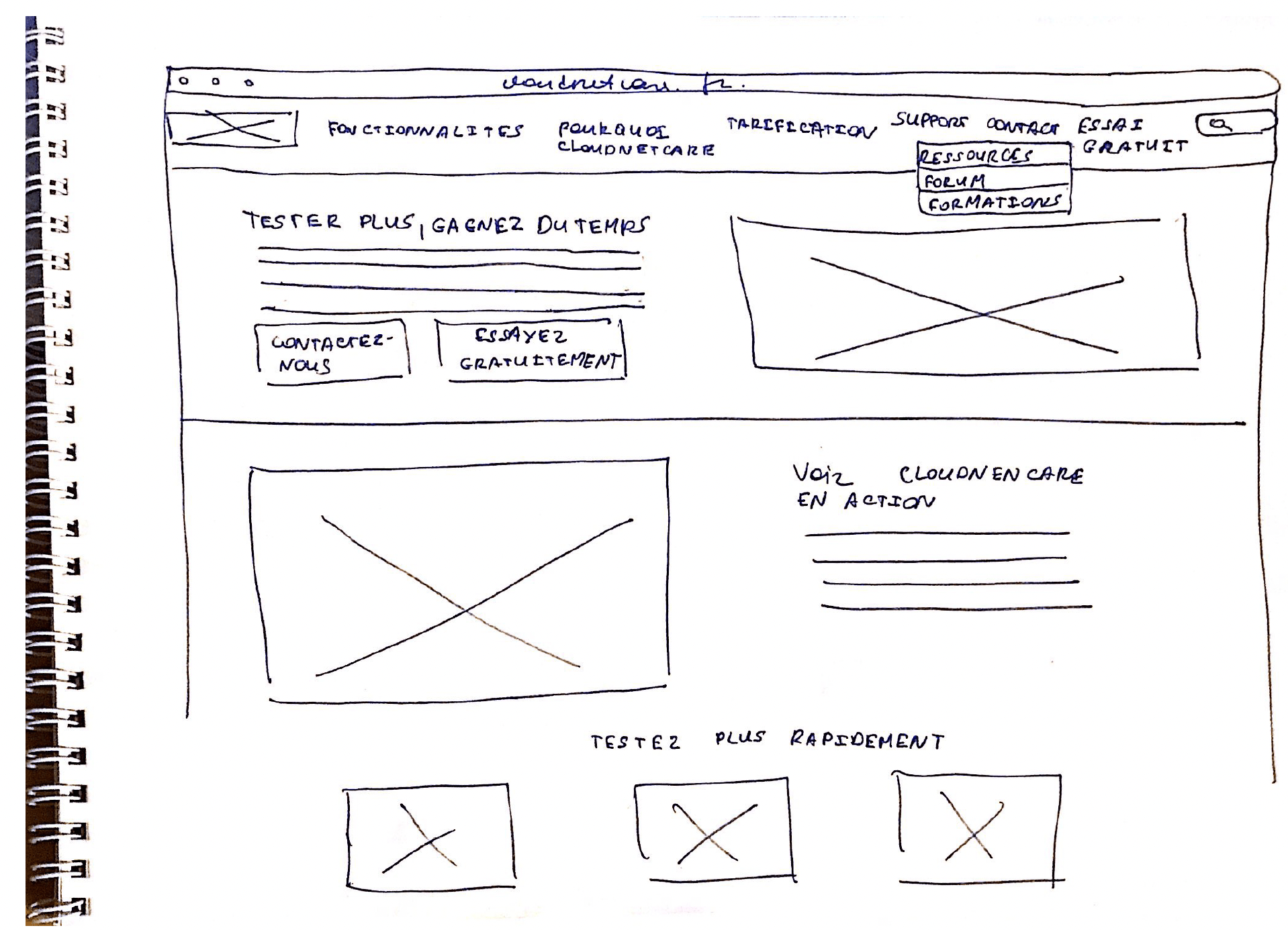
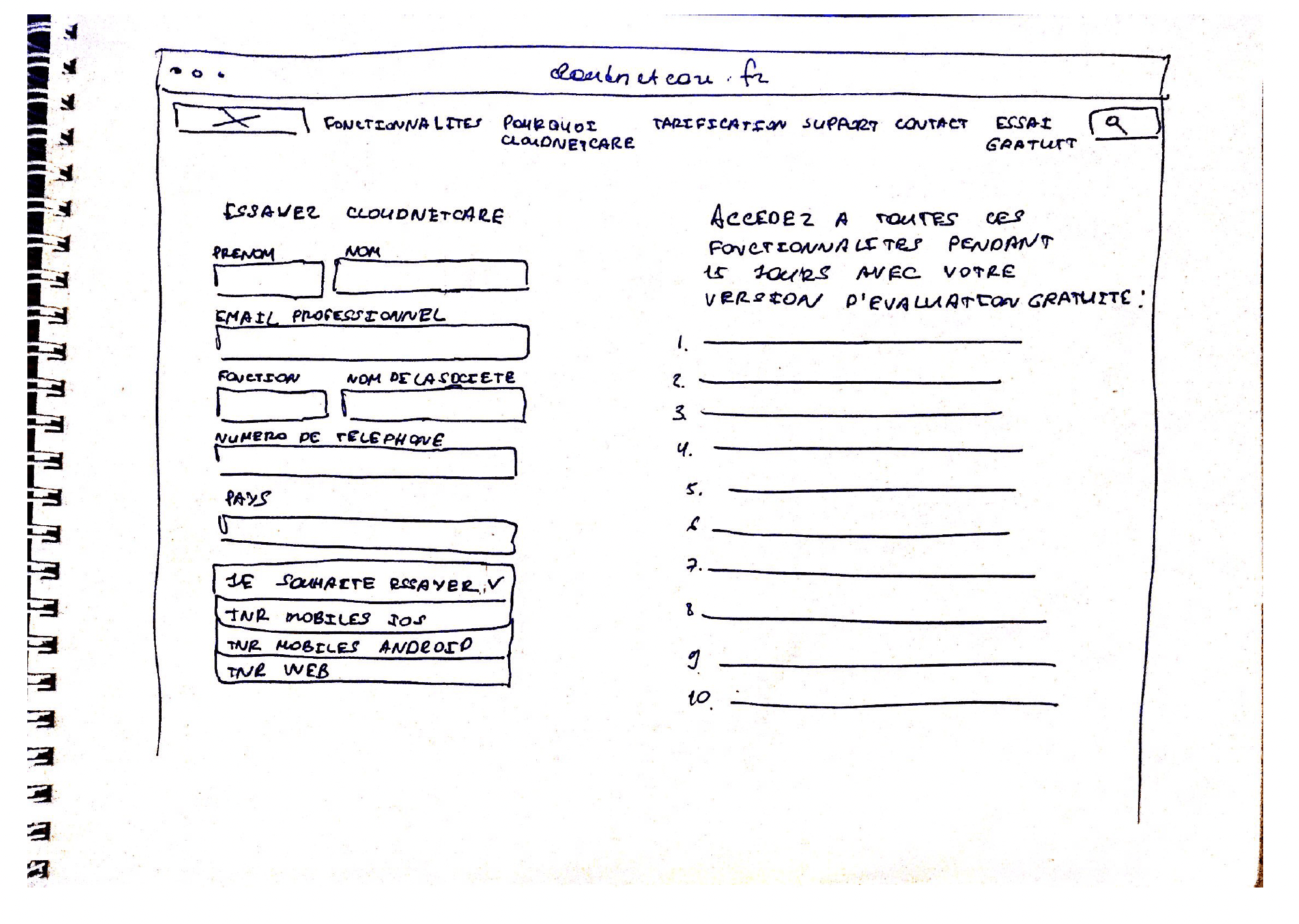
Sketches
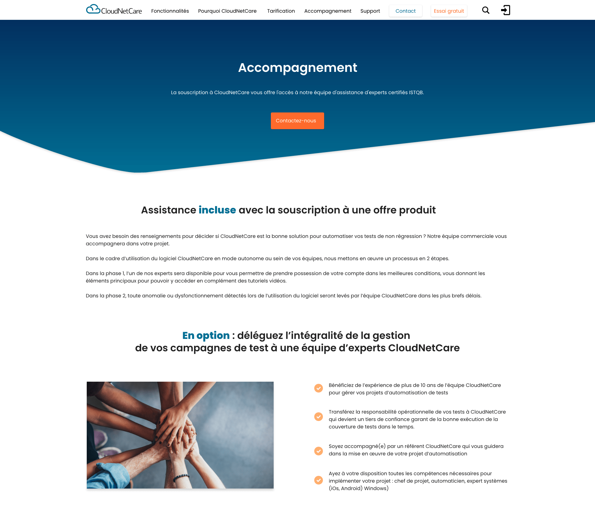
I sketched out a rough idea of how the screens would look in order to resolve some of the pain points encountered on the CloudNetCare website in my research. I was particularly interested in making clear the main purpose of the website (selling an automated regression testing software as a product), and designing a new navigation menu displaying all needed relevant details :
- Features
- Why CloudNetCare
- Pricing
- Support
- Contact
- Free Trial
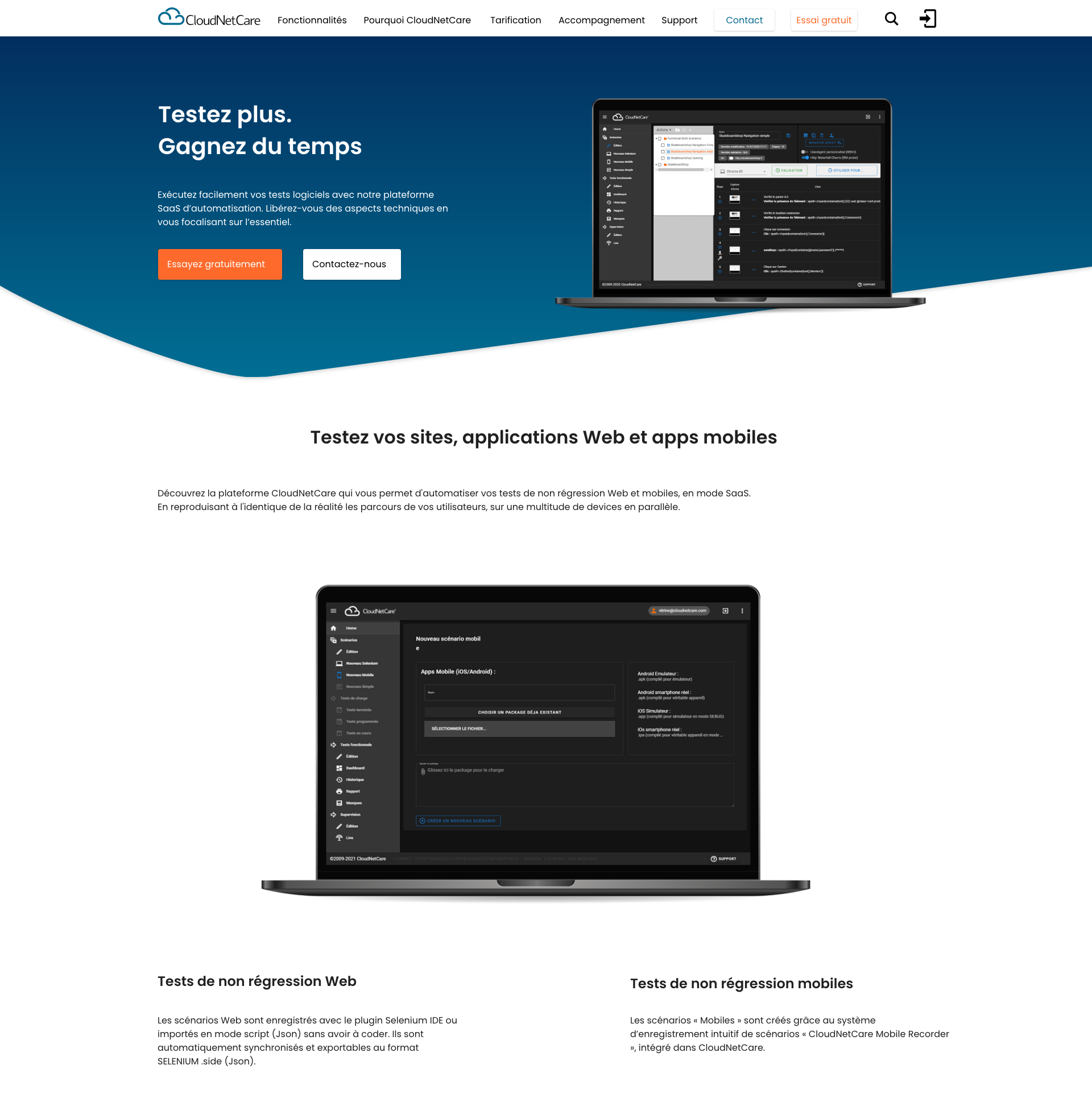
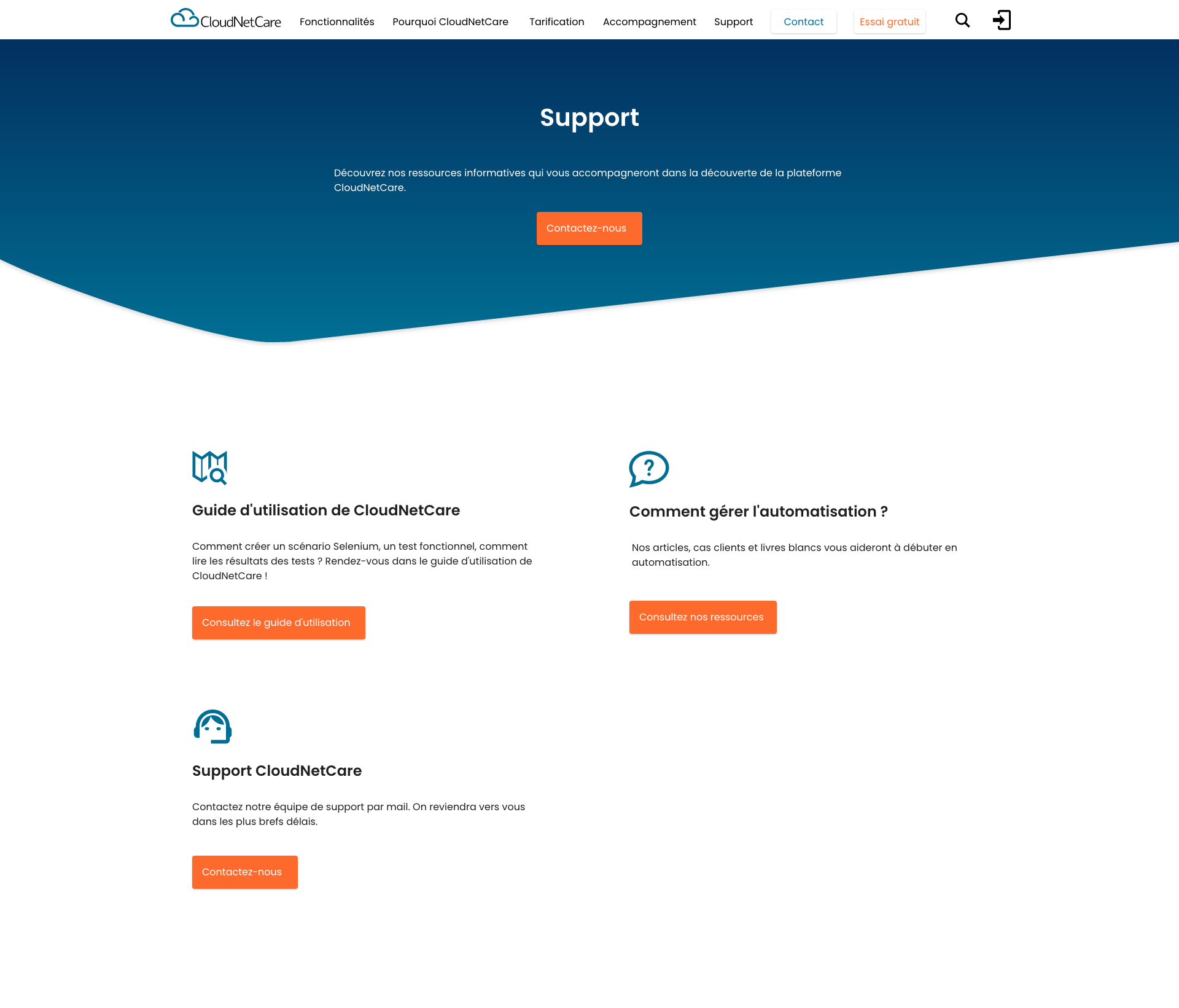
High Fidelity Prototype
For this project I used Adobe XD to design the new screen states as well as the interactions.

Validate
Usability tests of the redesigned website
I tested the redesigned website to see if the problems encountered during the first phase of usability tests had been avoided in my new design.
The feedbacks I received were very positive, particularly for the pricing page and the page explaining competitive advantages of CloudNetCare.
Also, users appreciated the clarity of the product presentation which was really great to hear as during the first session of usability tests users were not happy about the way the product details were explained.
Users noticed as well that the website structure got more optimised – “much more organised”, “a significant improvement”.
Conclusion
Things that went well
- I am confident that the new version of the CloudNetCare website with a smoother user experience compared to the previous version will contribute to increased conversion rates.
- I made the company’s offer and key value proposition clearer on the home page so visitors could immediately understand the purpose of the website
- A quick comparison of different offers being the user’s main goal, I added all necessary information about the software features, competitive advantages, pricing, support available in the navigation menu.
- I put prominent CTAs on all the relevant pages, making easier for users to enter a conversion funnel, navigate through the website and reach the key lead generating pages: the “Contact” page and the “Request a demo” page.
Things I would have done differently
- I would have preferred to use Figma instead of Adobe XD to create a prototype and a UI design.
- I would have also organised my usability tests differently, which were more marketing oriented due to my mission at the time. I would have asked users to perform tasks rather than give me general feedback about the CloudNetCare offer to gain more feedback on the user experience problems. I would have also recorded my usability tests (which were numerous).