Carl Zeiss AG branded as ZEISS, is a German manufacturer of optical systems and optoelectronics. ZEISS has more than 50 000 of web pages dedicated to different businesses units and countries
As a part of this project, I was in charge of creation of a new module that would captivate and impress visitors to ZEISS corporate website, enhancing their experience as they engage with our stories. Business stakeholders requested a module that would allow combining multiple images to quickly convey the narrative and leave a strong first impression. This new module creation aimed to evoke emotion in readers and inspire them to connect with the ZEISS brand.
Goal
Reach 2% CTR for the story telling page content improving engagement with brand related media items
My role
UX research (competitor benchmarks), UI design, Prototyping, Usability testing, Dev hand-off, Design QA
Result
CTR increase from 0.44% to 2.34% for the story telling media content on a ZEISS corporate web page
Problems to be solved with the design concept
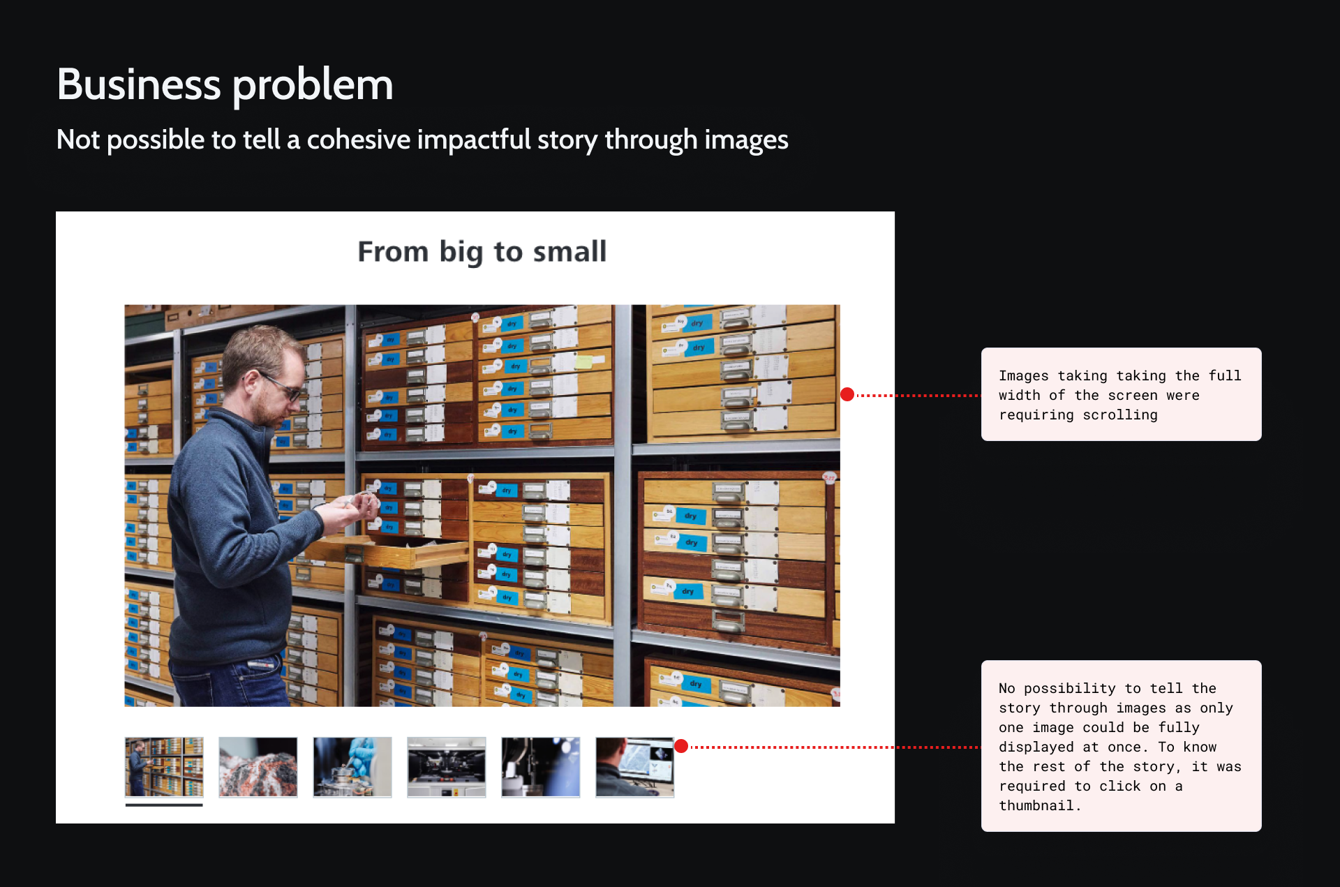
Main business problem was an absence of a suitable module that would allow to inspire, engage, and leave a lasting impression on users through impactful visuals and compelling narratives. Before the design of the new module started, they used Image slideshow module which was now allowing to tell a cohesive story and create an immediate emotional connection of users with the ZEISS brand.
The large images of the Image slideshow module taking the full width of the screen looked disconnected, requiring users to manually slide through the content, disrupting the user flow and context of the narrative. This format lacked the emotional engagement and fluidity needed to effectively convey a brand story.
Process

Working on the design of this new module, I went through the following steps of my design process
Refinement
I gathered requirements from different business stakeholders to identify the problem to solve. As ZEISS has different business units, the challenge was to provide the solution that would fit all of them.
During those workshop I learn about the following additional business goals of the design concept:
- Strengthen the Brand through storytelling
- Present and explain brand initiatives
- Share visual and narrative impressions of buildings or events
- Highlight key content that reinforces the brand’s identity
I also got information about existing use cases that were the following:
- Communicate storytelling and event experiences (e.g., impressions from recent events)
- Showcase the ZEISS Museum/Forum to provide a compelling sense of place
- Reinforce the brand narrative through cohesive storytelling
- Clearly illustrate and explain brand initiatives
Also, during alignments with stakeholders, the following requirements supporting the main business goal were identified:
-
Side-by-side media items display: Allow multiple images to be displayed side by side for an immediate understanding of the story, with this feature available at least on desktop.
-
Image interactivity: Images should be either clickable or have a magnification option (optional).
-
2-6 media items: Display between 2 to 6 images at once, ideally in varied layouts.
-
Captions: Provide an optional caption for the entire module, with the ability to add individual captions for each image in magnification mode.
-
More images available additionally: In addition to the combined view, offer further images through an image gallery.
-
Video/motion integration: Enable embedding of videos and motion graphics.
-
Enable combination of different media types: Allow for seamless integration of videos or motion content alongside images.
Research
As a part of research phase, I explored how different websites organize visuals in a media gallery to identify conventions and best practices.
Design
I went through several iterations of design starting with wireframes. I progressively showed my design to business representatives to adjust features or add missing ones depending on different use cases. For example, following on of the calls with Project managers, I found out I needed to enable caption and copyright for every singly image in the “overlay” view.
Validation
Once the design was ready, I did a technical feasibility check with the development team and then validated it with different business stakeholders.
Delivery
I prepared a detailed design documentation for a handover to our development team.
Research
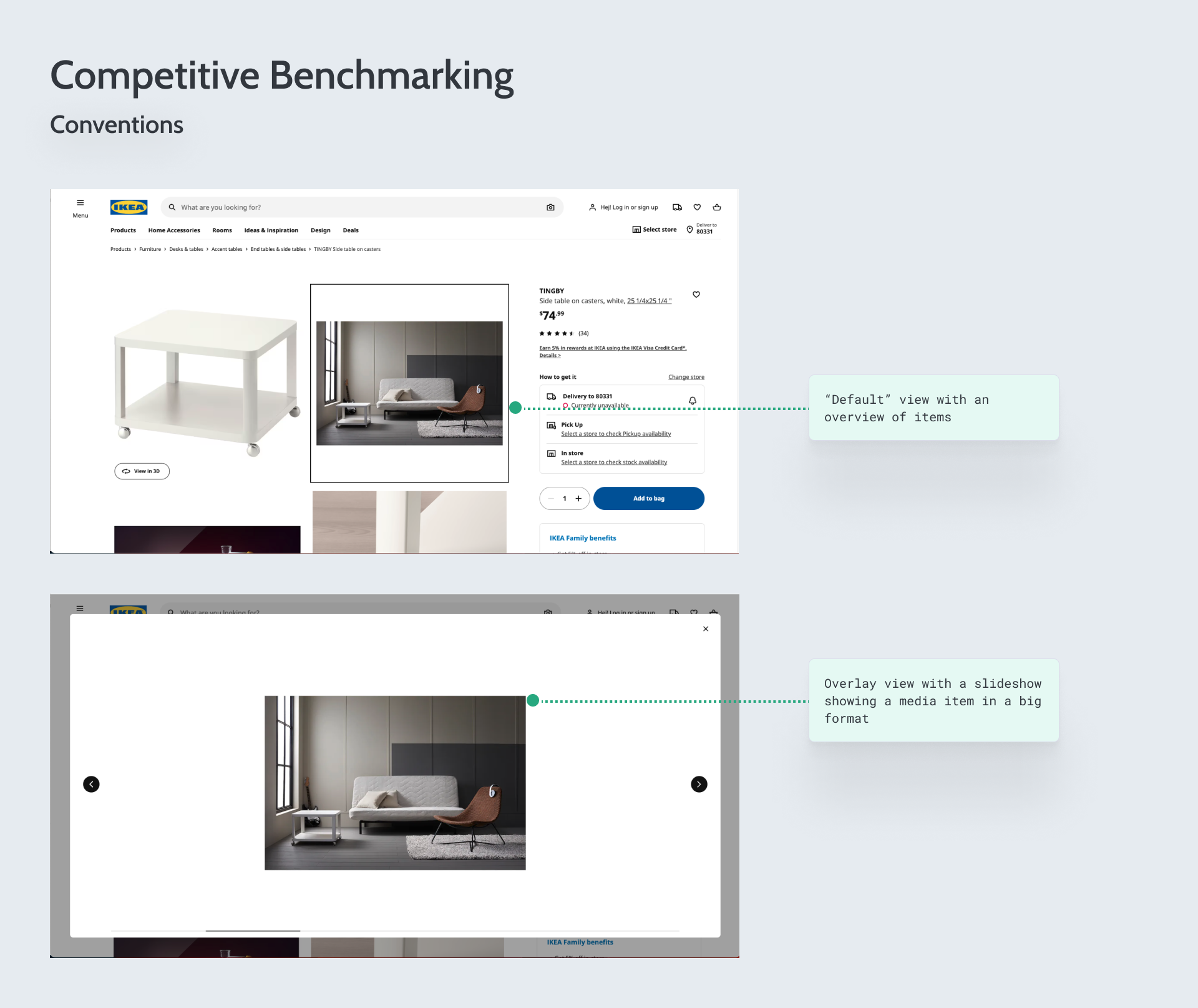
Competitive Benchmarking: conventions
After analyzing how different websites organise their images in media galleries, I identified that media gallery is often presented with the “default” view” on the page offering an overview images. Clicking on one of the media items opens an overlay with a sideshow that display each media item in a bog format.
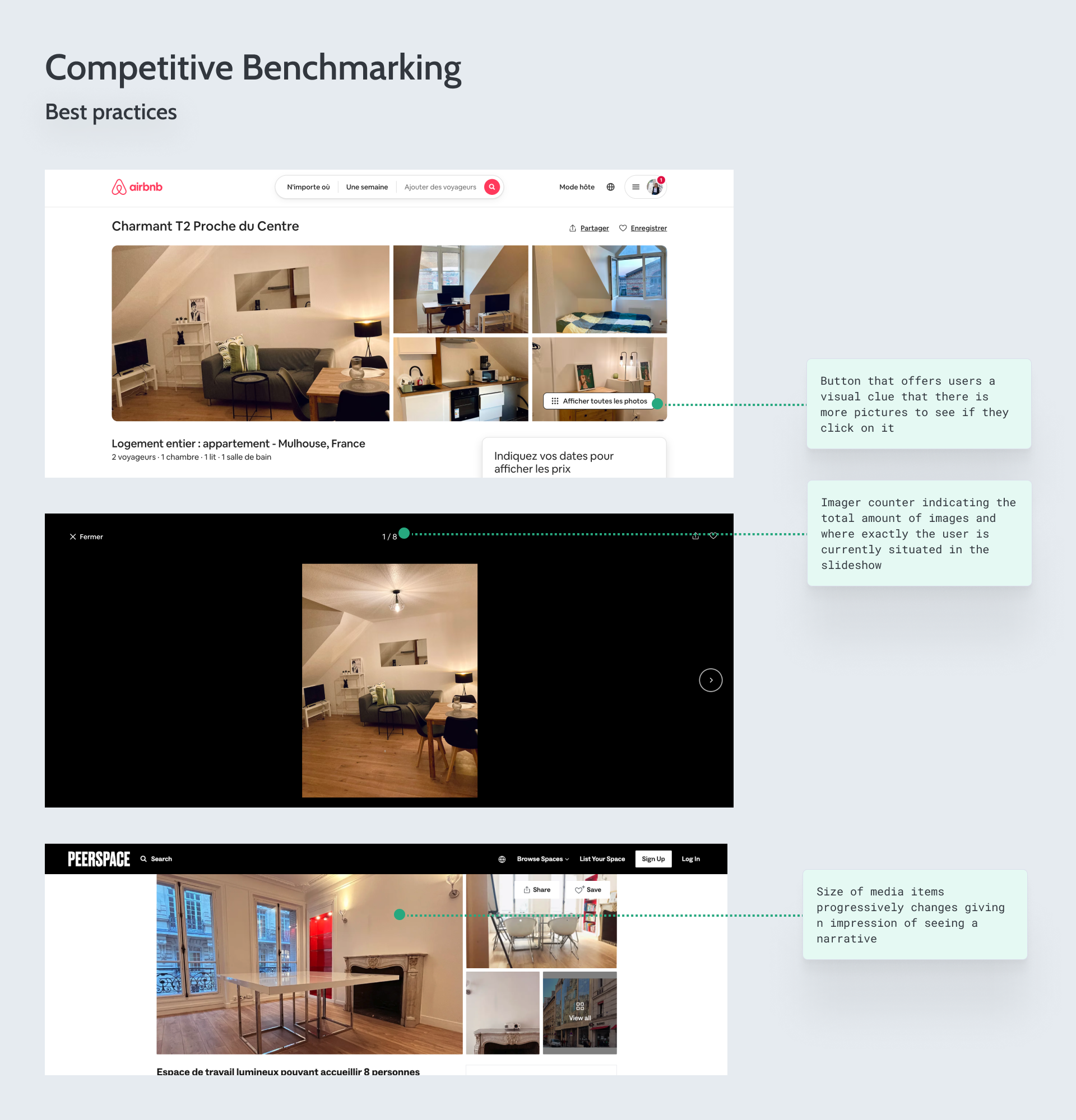
Competitive Benchmarking: best practices
Airbnb places a “Display all pictures” button that offers users a visual clue that there is more pictures to see additionally to what they can see in the default view on the page.
After opening the slideshow and clicking on one of the images, I can see an image “counter” at the top of the screen giving user information about how many picture is there in total and the place of the currently displayed picture in the slideshow.
A coworking space “Peerspace” organizes image in a way that their size progressively decreases giving an impression of seeing a story, comparing to Ikea’s media gallery on the product page where all images have the same square size.
Design
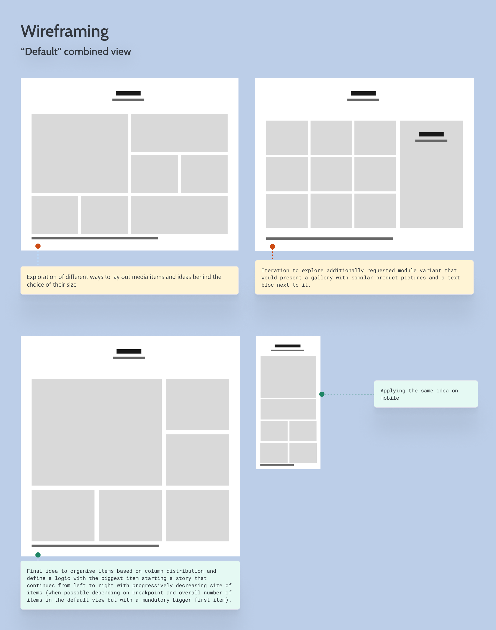
Wireframing: “default” combined view
After benchmarking, I started exploring different design possibilities with low fidelity wireframes. First I started exploring different ideas for the default combined view. My first iteration was about imagining how to organise items in a gallery layout, would it be based on aspect ratio or column distribution, would their size be randomly picked or there would be a defined logic.
On of iterations aimed to explore the possibility of adding the text bloc to the media gallery to meet an additional requirements that popped up during alignments with stakeholders. They needed a module variant that would represent gallery of product images with additional texts. As all product images (very similar pictures of eye lenses) would have equal importance, that would mean they would need to have the same size with no possibility to create a narrative (main business goal of the design concept).
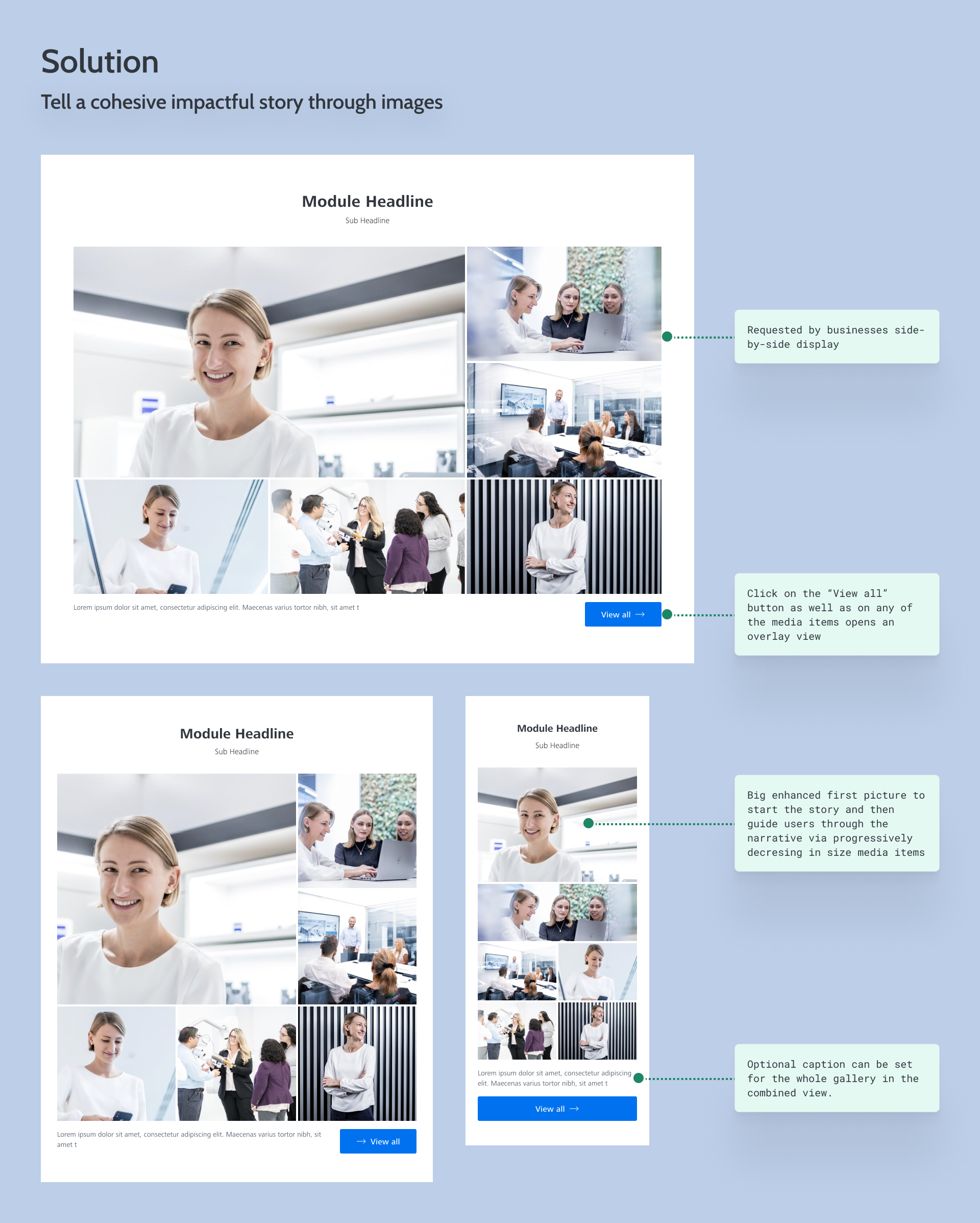
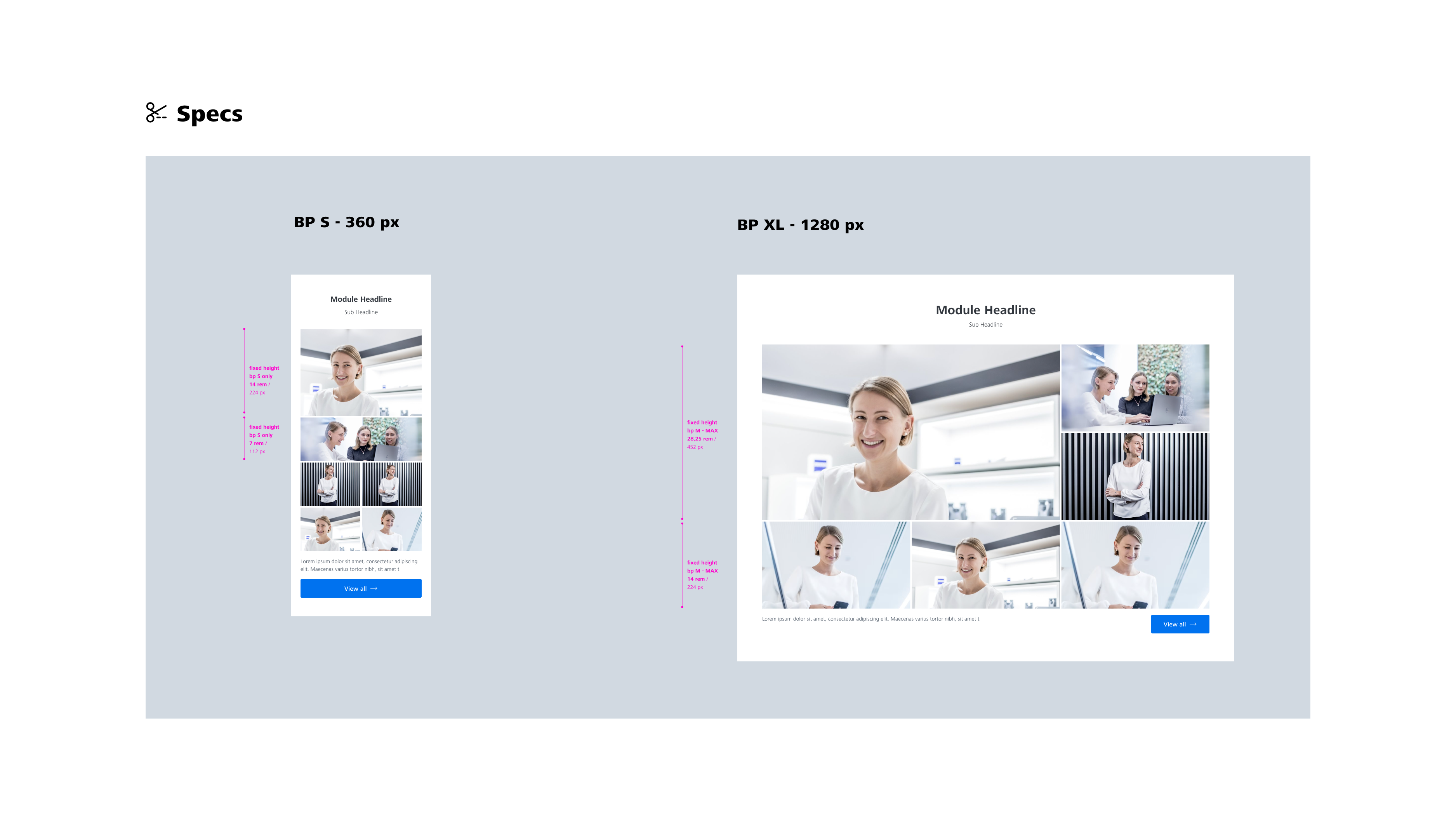
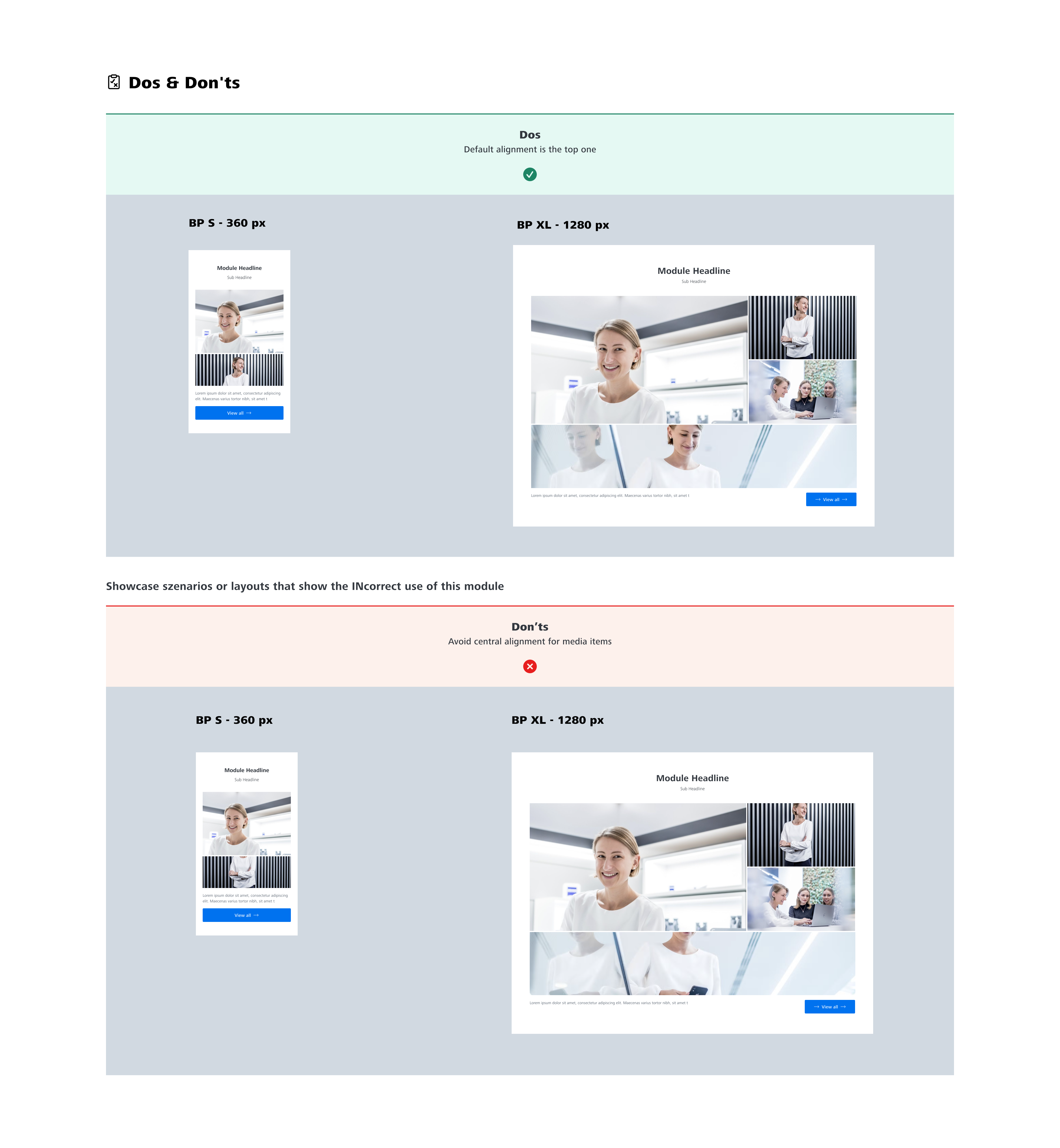
Finally, I decided to organise items based on column distribution and define a logic with the biggest item starting a story that continues from left to right with progressively decreasing size of items (as progressively as possible but at least the first picture should always be the biggest one).
Wireframing: overlay view with more media items
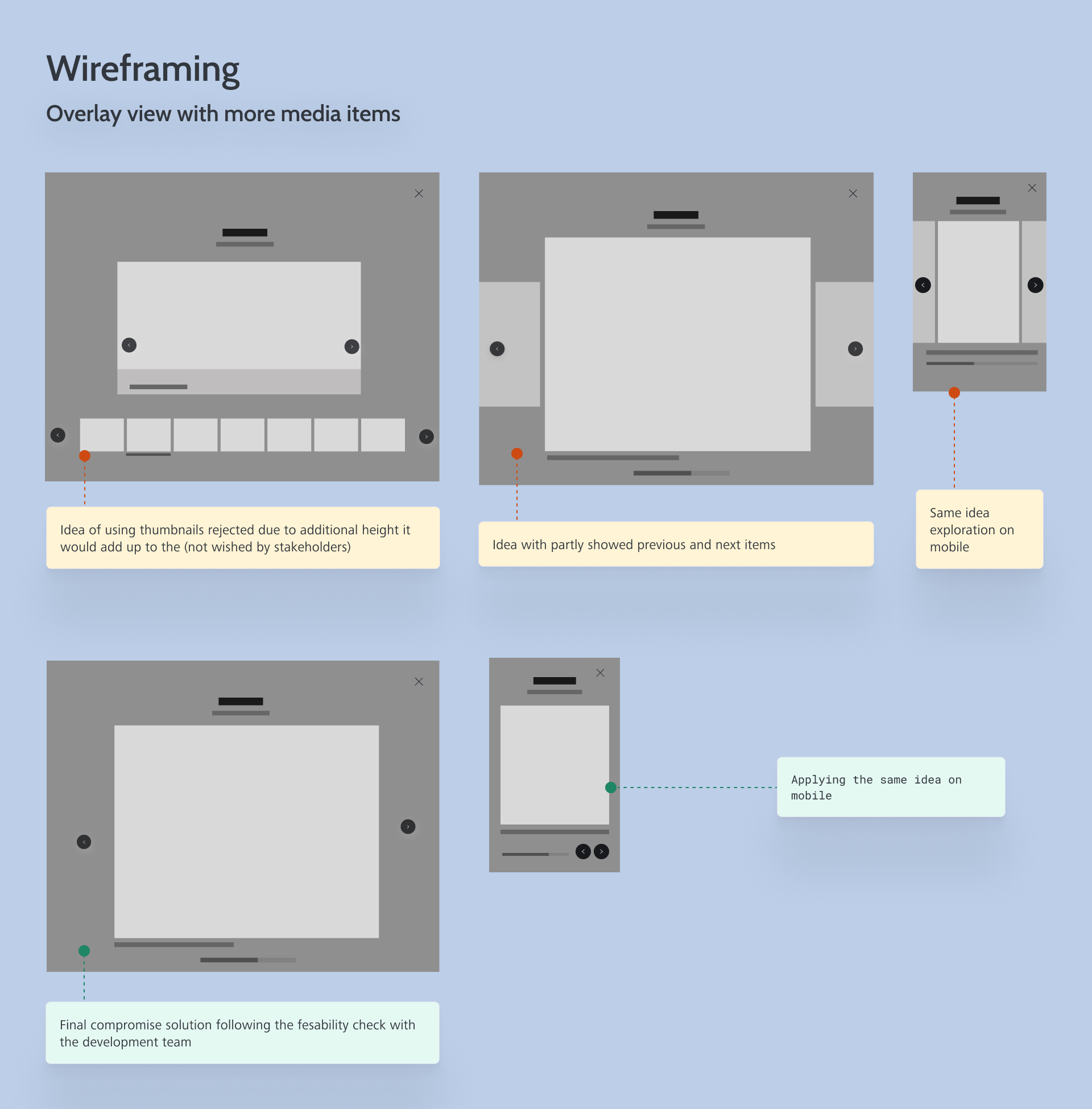
To meet the requirements regarding more images that might additionally be available, I picked the overlay idea commonly used across different websites. With this feature in mind I mainly explored different ways of presenting the slideshow. First idea was to use the thumbnails displaying them below the image but then it was adding up height and was resulting into scrolling necessary to see the thumbnails (not wished by business representatives.
Next idea to explore was to partly show previous and next media items (displaying them with a reduced size and with transparency) and with carousel behavior (so that uses could scroll through the slideshow). This solution would allow to clearly show to users that there is more to see, This solution didn’t pass feasability check with front end team.
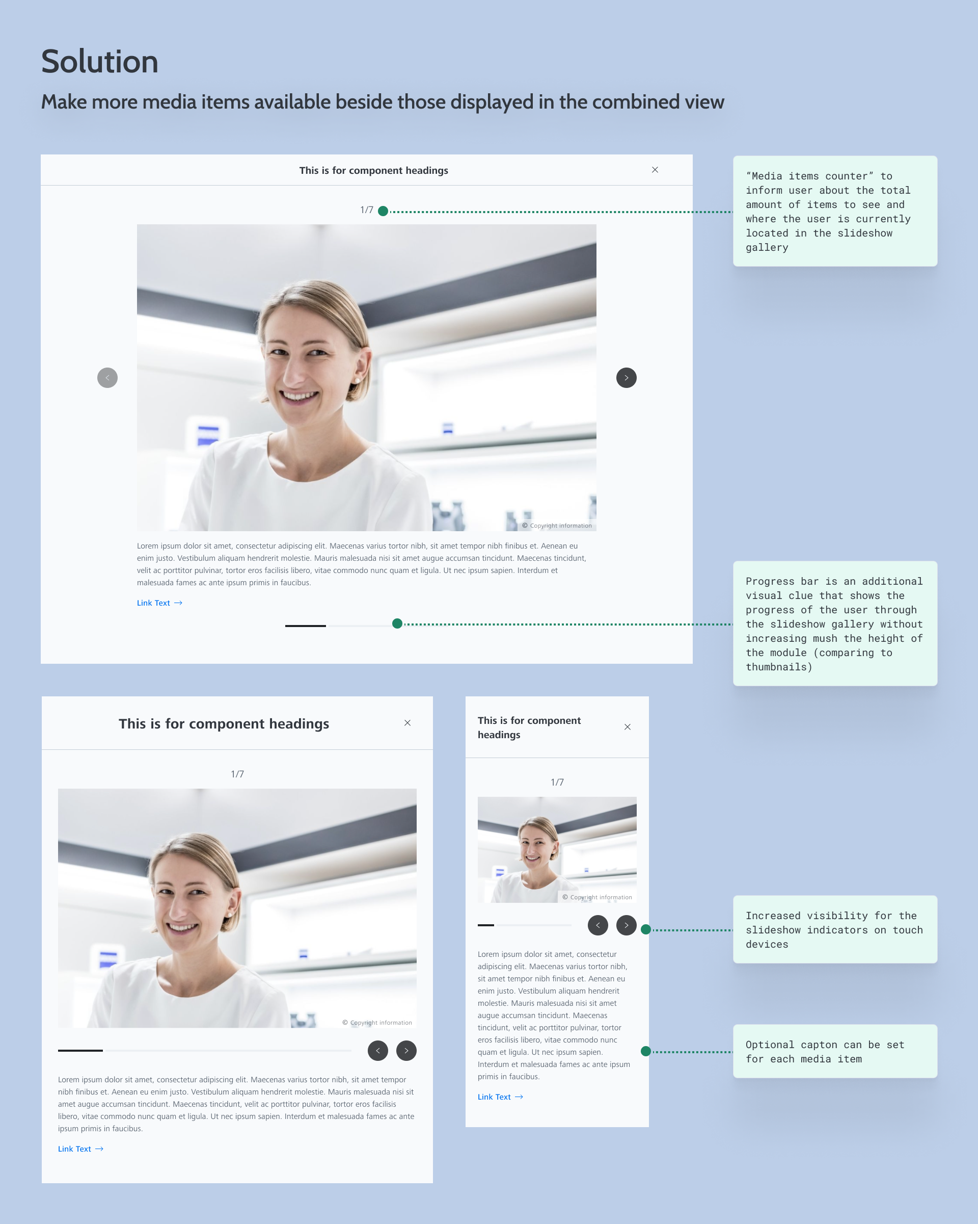
Finally, I came up with a compromise solution – having slideshow indicators on the right and on the left to the media item. I added the “media item counter” at the top of the slideshow to inform users about the overall quantity of items to see and put a progress bar on the bottom as an additional visual clue.
Solution: tell a cohesive impactful story through images
To address the business problem, I provided a design of a media gallery where one main media item is a starting point of the story (to be defined by editor) and than the hierarchy is set via the size of other media items (story logic is going from left to right).
I designed different layouts for the “default” combined view depending on the breakpoint and number of media items: it’s a layout based on column distribution with 2 columns on mobile, 3 columns on tablette and narrow desktop screens (1040 px, 1280 px) and 4 columns on larger breakpoints starting from 1440 px.
Solution: make more media items available beside those displayed in the combined view
To meet this requirement, I designed an overlay that opens after a click on the “View all” button or on any of the displayed media items. As following the technical feasibility check with the development team the initial design was not possible to implement within the story scope, I suggested a compromise with a similar but easier to implement slideshow features.
In parallel, I improved usability of slideshow indicators on touch devices by moving them below the image (before they were put on the top of the image across different modules with slideshow functionality).
Also, to meet the requirement to provide one optional caption for the module at a glance and optional captions for each item in magnification mode, I made available optional captons for the whole gallery and each media item within the overlay view.
Delivery
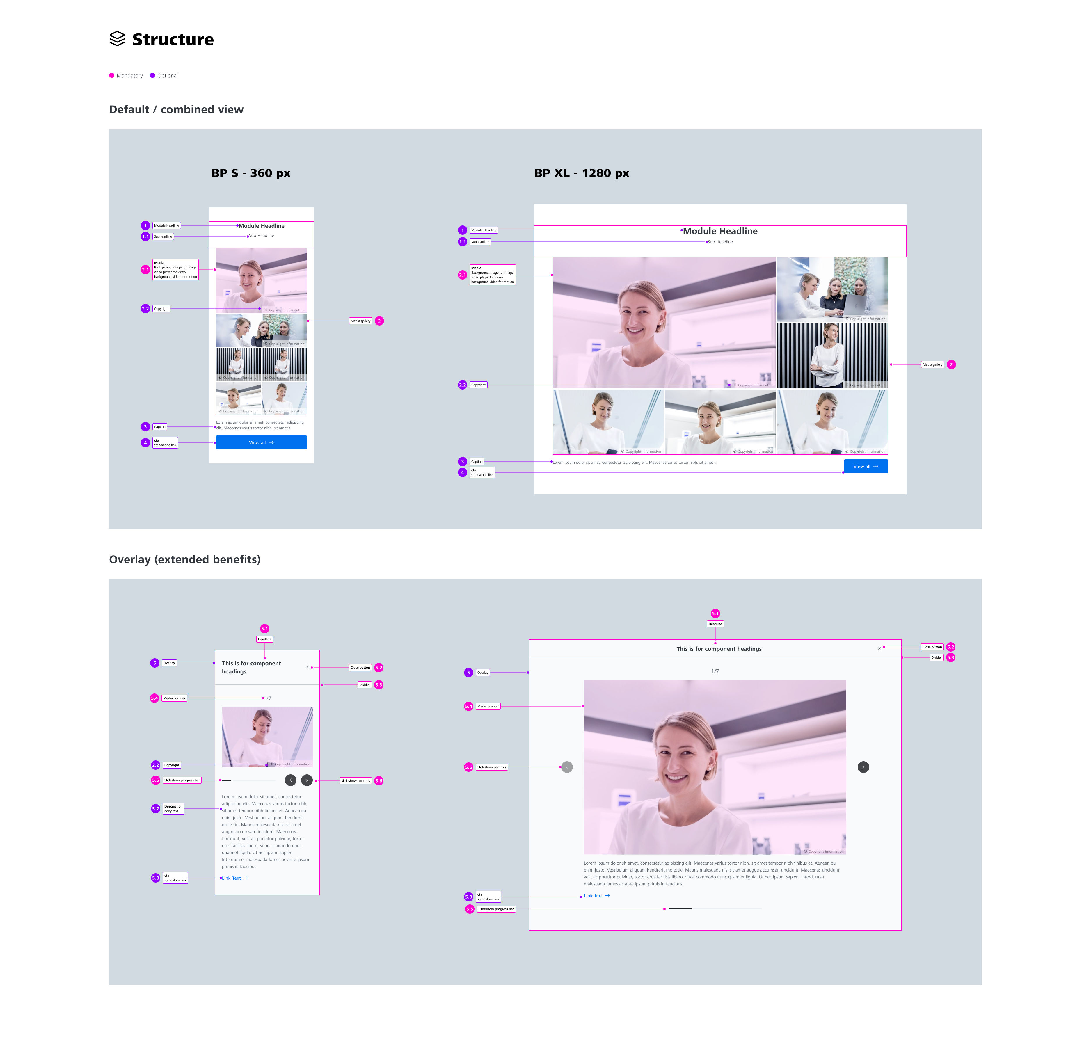
Design documentation
Once I tested and updated my design concept, it was time to create design documentation in Figma for our development team.
Conclusion
Things that went well
Working on this design concept, I used low fidelity prototype in the validation process with business stakeholders which allowed to speed up the work and focus on features instead of UI part
Things I would have done differently
As a part of this design concept, I did my usual technical feasibility with the development team but not with all developers but only with a couple of colleagues. Later it turned our that other team members had different opinions which led to the situation where some features I designed were identified as not implementable within the story scope. After this experience, I include all available member of the development team.
